
Investors are wise to look at more granular classifications of the business cycle and not just relatively infrequent NBER recessions.
Yield-curve slopes and equity market returns can be used as nowcasting signals to identify turning points of the business cycle.
Market signals are implying a number of developed markets—notably, Japan, the United States, and Germany—are now entering the correction phase of the business cycle. Trade wars, Brexit, debt issues in Italy and Spain, and political problems in Germany and Italy can make the road ahead a lot bumpier than the road we have grown accustomed to.
The three most common expressions in aviation are: Why is it doing that? Where are we? and Oh crap! – Anonymous
As in aviation, the questions “Why is it doing that?” and “Where are we?” also happen to be very commonly posed by economists and market watchers. For the most part, we never truly know where we are in an economic cycle until after the fact. By that time, if anything meaningful has changed, it’s usually an “Oh crap” moment for investors. Due to the delayed nature of many economic indicators, over the last few years nowcasting has become part of the investment lexicon, especially for market participants looking to get a leg up on the competition and in their own portfolios.
In this article, we show how simple and easy-to-access market fundamentals can be used in real time to identify multiple stages in the business cycles of developed economies, going beyond the usual narrow characterization of recessions. Indeed, for the purpose of investing, we must look at all business-cycle states, not just those identified by the National Bureau of Economic Research (NBER), the entity responsible for dating US recessions, whose motivations may not align with the needs of investors. Hence, we review evidence from bond and equity markets as useful descriptors across all major business-cycle stages. Furthermore, we take a global perspective by applying our findings across 14 major developed markets.
Our evidence shows that bond yields and equity returns can provide clarity as to the current phase of the business cycle, especially during transient states when economies tend to turn the corner on the next phase. Specifically, the slope of the yield curve tends to peak when an economy is rebounding after a recession, and it flattens or inverts when economic growth loses momentum. We also find that equity returns can be used as a second predictor to further refine the identification of the business-cycle stage. These results paired with the most recent market trends imply that a number of major developed markets may be currently entering the correction phase of the business cycle, producing above-potential output, but in the midst of a slowing economy. The good news is that not all corrections turn into fully fledged recessions; the bad news is that the road ahead may be bumpier than what we have grown accustomed to over the last few years.
Throwing Our Hat in the Ring
By discussing market variables and the economy, we join a crowded field. For example, with the recent flattening of the US yield curve, the slope is back in the news, as any search of Google Trends will attest. As a widely accepted predictor of economic recessions, the slope is generally defined as the spread between the yields of the 10-year government benchmark and a shorter-term government benchmark, often the three-month maturity. Historically, a downward-sloping yield curve foretold of higher unemployment, slower real GDP growth, and falling wages and industrial production, and was viewed as a signal for investors to move toward a risk-off portfolio position.
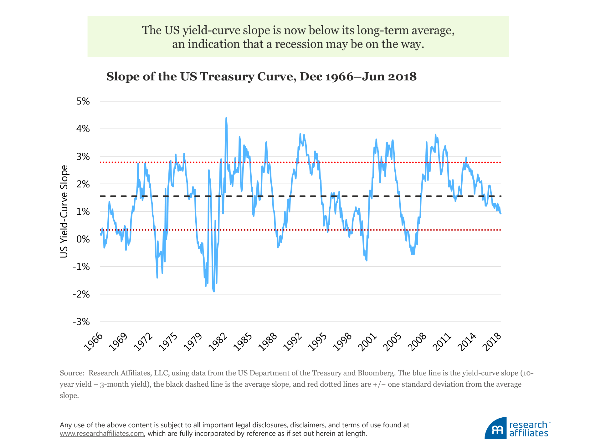
In the United States, the yield curve has been flattening for the better part of the last decade, albeit from a level of significant steepness following the global financial crisis. The most recent march downward started in early 2017 and has taken the yield-curve slope to a point below its long-term average to a level not seen in a flattening cycle since early 2005.
Moreover, the slope is not the only market-based indicator that has been raising concerns. Indeed, the recent jitters across international equity markets have heightened investors’ fears that bad economic times might be just around the corner.
Decoding the Business Cycle
In order to understand where we are in the economic cycle, we suggest a simple framework for classifying the various states of the economy over a full business cycle.
In the United States, an NBER-classified recession is a relatively narrow set of events in which a contraction is observed across a wide array of indicators. Since 1953, according to the NBER, the United States has been in recession only 14% of the time; since 1990, this has fallen to 10%. Arguably, a more granular framework than a binary “in” or “out of” recession could be a more valuable tool for investors.
In order to define a set of business-cycle states, we intersect two output-based metrics. The first metric is the well-known output gap, which measures whether the level of production is above or below its estimated potential level, based on data from the OECD (Organisation for Economic Co-operation and Development). We then combine this output-gap data with country-specific slowdowns and expansionary phases as measured by the Federal Reserve Bank of St. Louis (available in the FRED database). These phases indicate the momentum, or speed, at which the economy is running. The intersection of these two measures allows us to classify four stages of the business cycle.
Four Business-Cycle States
e name these four interaction states as follows: bull economy, correction, bear economy, and rebound. In a bear economy, for instance, the output level is below its potential and its growth rate is decelerating, which produces a double whammy! Arguably, the global economy may now be shifting from a bull economy to a correction phase, as suggested by current volatile market conditions.
| Interaction (Business-Cycle) State |
Economic Potential (Output Gap) |
Economic Momentum (Expansion/Slowdown) |
| Bull Economy | Above | Accelerating |
| Correction | Above | Slowing |
| Bear Economy | Below | Slowing |
| Rebound | Below | Accelerating |
In the United States, since 1966 each of these economic states has lasted an average of about 12 months, with recoveries lasting slightly longer at 15 months. Said another way, on average, a full business cycle lasts between four and five years. Looking at the other major developed markets of Germany, Japan, and the United Kingdom, we see the same picture, although data availability means our lookback period is more limited.
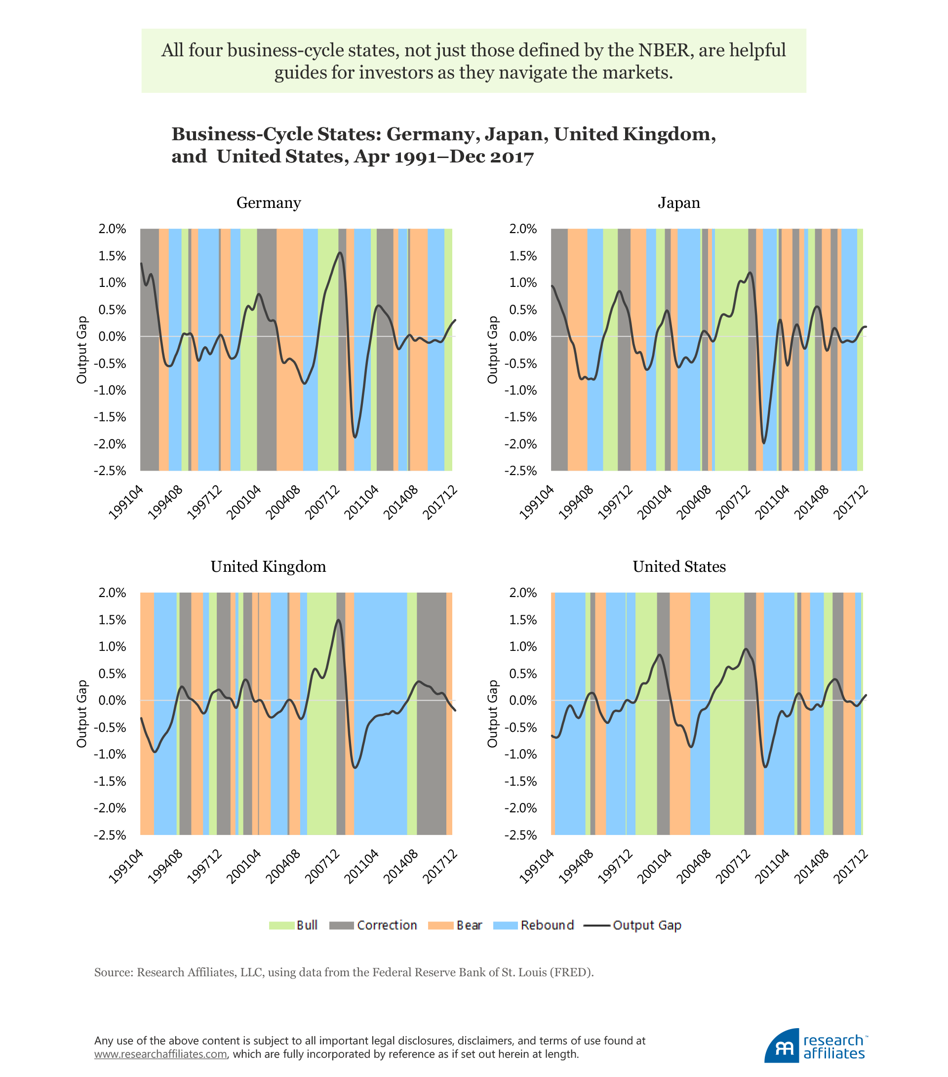
Using these economic variables as the basis of a business-cycle framework results in business-cycle states that are easily identifiable and reproduceable, not to mention familiar to most investors; however, we note a few catches. Both the output gap and the expansion/slowdown measure are not known in real time. Additionally, the four economic stages are the byproduct of a statistical filter, which uses forward-looking information to determine historic peaks and troughs in the economy. Therefore, we need a different go-forward mechanism to identify the present economic state.
Nowcasting with the Yield-Curve Slope
As we have already noted, the slope of the yield curve has long been used as a predictor of recessions.1 In particular, the slope of the yield curve usually becomes flat or inverted ahead of an economic recession. Possible reasons for this include 1) monetary tightening by central banks that may precede a slowdown in economic activity, and 2) a change in investors’ long-term interest rate expectations and/or required compensation for holding duration risk.
Turning to our four-state framework, we can see that the slope—computed as the spread between the 10-year and three-month government benchmark yields—shows a consistent pattern across a set of 14 developed markets over the period April 1991 through December 2017. First, we calculate the slope at the end of each month for each country and remove the country average from each observation; in this way, we are able to isolate deviations from the norm at the country level. We then categorize each month into one of the four business-cycle states of bull economy, correction, bear economy, and rebound.
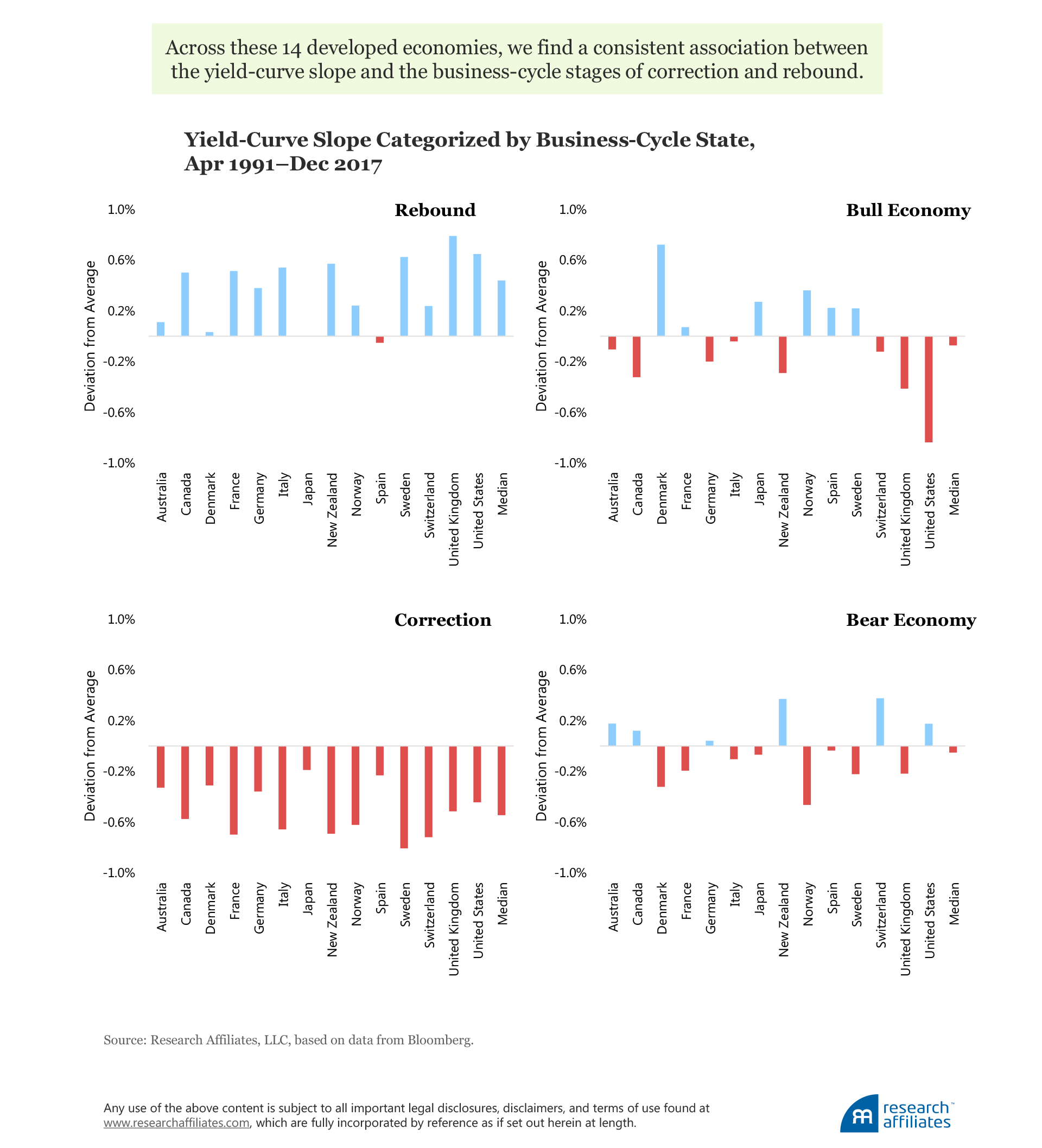
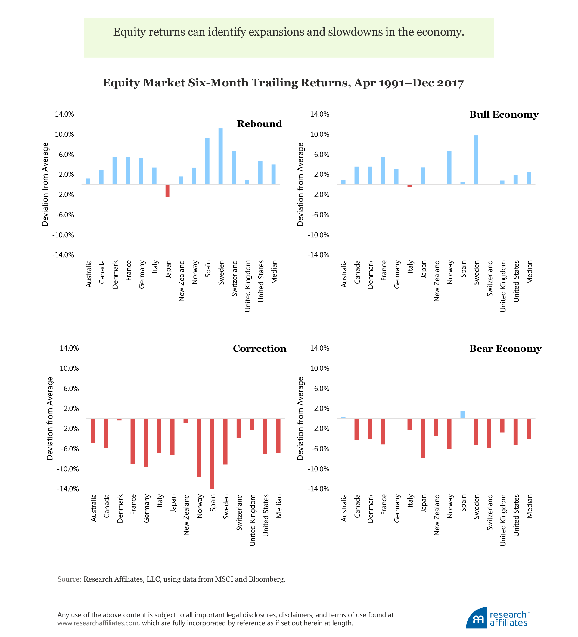
The evidence shows a consistent association between the slope and two of the business-cycle stages—correction and rebound—across our full set of 14 developed economies. In contrast, the evidence is mixed and inconsistent across countries for the bull and bear economic states. Additionally, the magnitude of the deviation in the yield-curve slope from the average over the sample period is larger in both the correction and rebound states.
In simple terms, our international evidence suggests that the slope of the yield curve is the steepest when the economy is rebounding after tough times, and is close to flat or even inverted when the economy is entering a period of subdued growth following exuberant times. The key insight is that the yield curve is a richer predictor of more than just recessions. First, not all correction phases eventually result in a recession, yet a flattening of the curve should indicate, at a minimum, a loss of economic momentum. Second, macro rebounds can be detected by above-average slope levels.
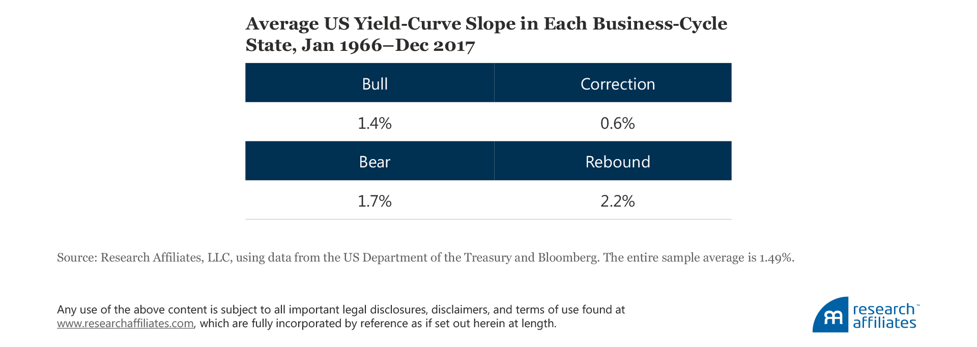
Diving a bit deeper, the United States offers a longer data sample to further validate the intuition gained from the international evidence. From 1966, the average slope of the US yield curve has been about 1.5%. In the bull and bear economic states, the slope tends to be similar to the average at 1.4% and 1.7%, respectively. In the correction and rebound phases, however, we see noteworthy deviations from the average with slopes of 0.6% and 2.2%, respectively.
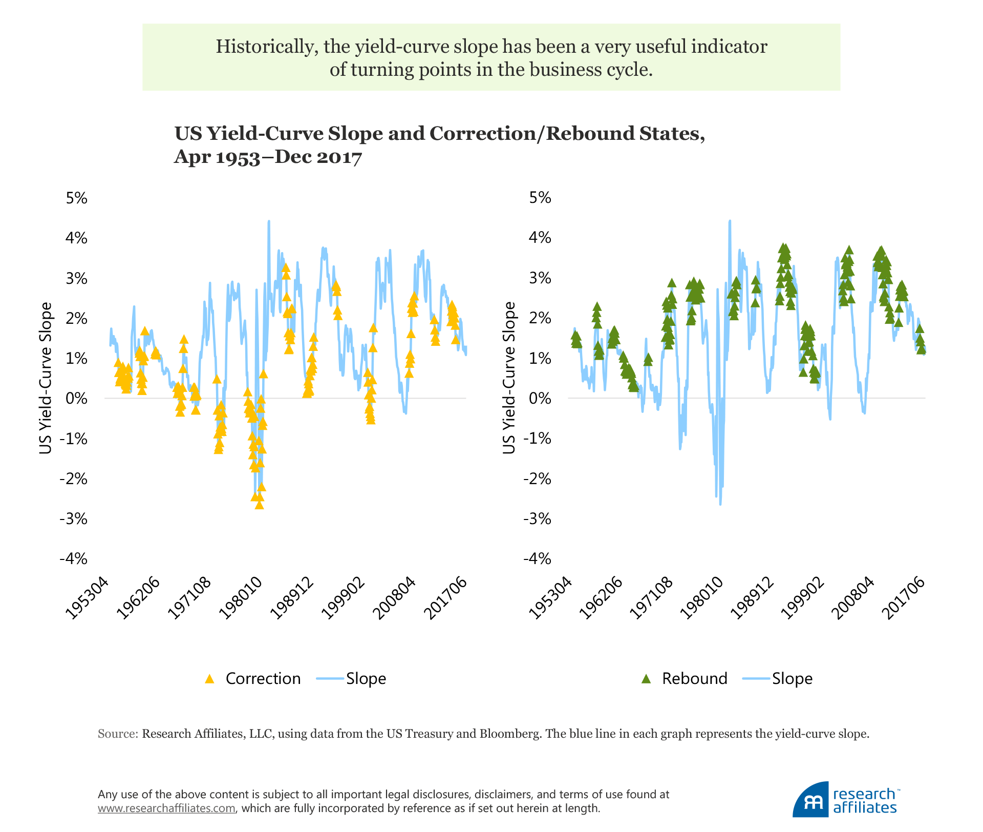
To further drive home this point, we turn to a visual chart of the yield-curve slope, overlaying our correction and rebound phases on the time series over the period April 1953 to December 2017. Although not perfect in all periods, we can see that, historically, rebounds have often coincided with a steep yield curve, while corrections have corresponded to a flat or inverted yield curve. All considered, the evidence suggests that the slope is a very useful indicator of the turning points in the business cycle.
Nowcasting with Stock Market Returns
To validate and extend our analysis, we now turn our attention to equity market returns. Indeed, changes in equity prices are useful real-time indicators because they reflect changes in investors’ expectations about future cash flows as well as their appetite for holding equity risk (itself a function of duration and credit risks).
Unlike the slope of the yield curve, which is an observable yield spread in a single period, we must choose a horizon in order to measure return. Because the average length of each business-cycle stage is about 12 months, it makes sense to choose a shorter period than 12 months to decipher cycle turning points. The more granular the period, however, the more noise is introduced into the process. As a happy medium, we use a six-month return.
Following a similar process as before, we measure the difference between each nation’s six-month trailing return and the full-sample average of contemporaneous equity market returns over the period April 1991 through December 2017. The results differ slightly from the slope analysis. Here we see that equity returns associate with a binary breakdown of the economy: up during rebound and bull states, and down during correction and bear states (although the magnitudes are larger for rebounds and corrections). This is consistent with the evidence that equity returns are good identifiers of expansions and slowdowns in the growth rate of the economy. More generally, this evidence confirms that the level of the slope and of equity returns appear to signal a similar direction for the economy.
The union of the slope of the yield curve and equity returns constitutes a happy marriage. By using these two indicators, we may be better able to filter false positives that could occur if we were to use only the slope. On the one hand, a below-average slope matched with negative equity returns is suggestive of a correction phase. On the other hand, an above-average slope matched with positive equity returns is a signal of entering rebound territory.
The keen observer will have noticed a bit of an inconsistency in our two market metrics. For bonds, we use a forward-looking, income-based, metric, whereas for equities we use a historical, return-based metric. This inconsistency is intentional, and we believe is a benefit of our approach because it incorporates two diverse perspectives as opposed to simply using two yield metrics or two return metrics.
What Does This Tell Us About Today?
Our findings paired with the most recent quarter-end market data imply that a number of major developed markets are currently entering correction territory. We create a scatterplot of the slope (x-axis) and the equity return (y-axis) for each of the developed markets in our sample set as of June 30, 2018. We divide the scatterplot into four quadrants consistent with the four business-cycle stages. The lower-left and upper-right quadrants, where the slope and return agree, are the correction and rebound states, respectively. In the other two quadrants, the signals are mixed and we cannot make a prediction. Countries near the origin have weak signals and few conclusions should be drawn about impending changes in their business cycles.
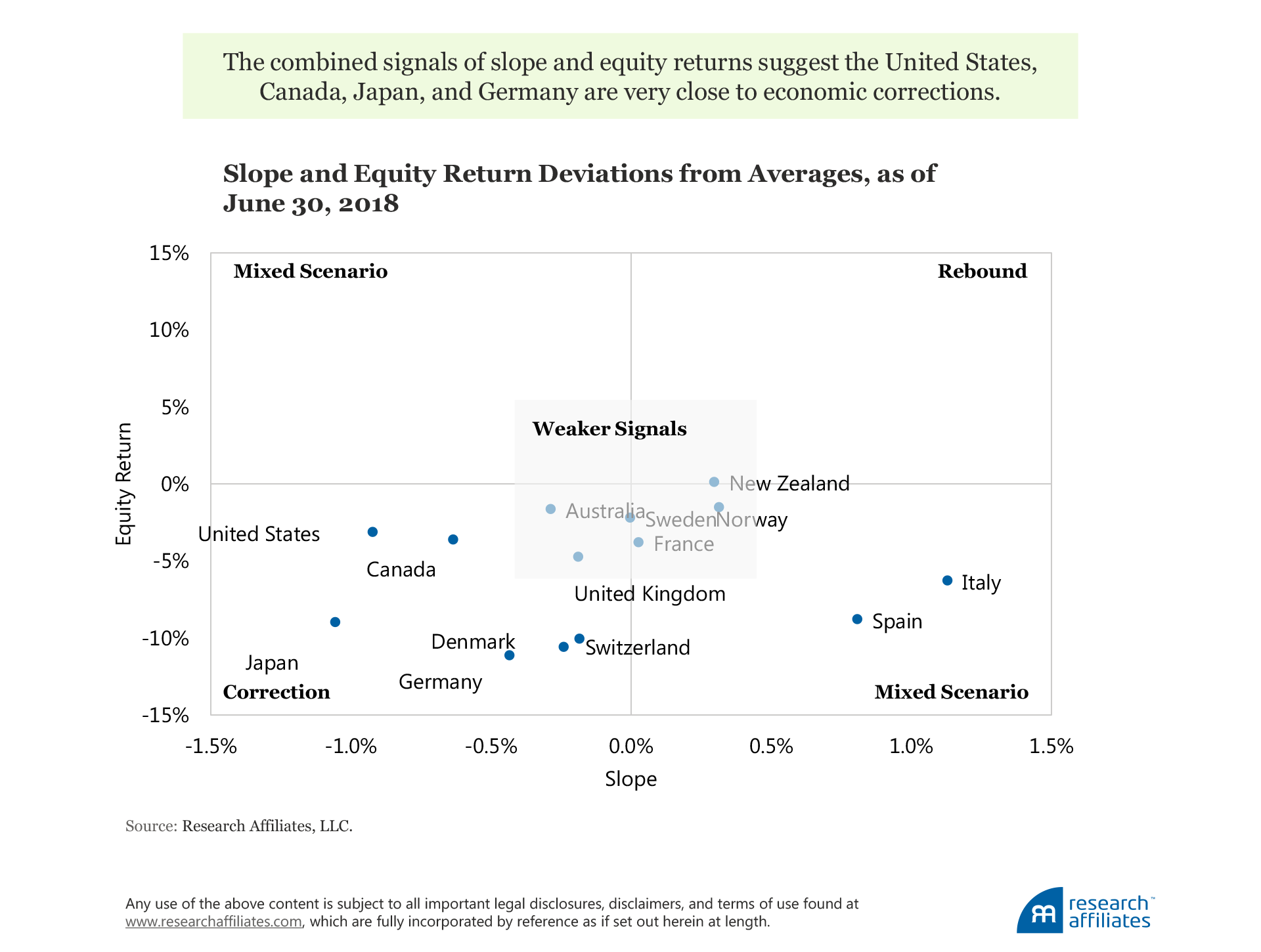
As we have shown throughout this article, these signals work well across developed countries and are useful in categorizing similarities in the business-cycle stage of groups of countries. Currently, a number of countries have very weak signals, but a few cluster in correction territory.2 In particular, for Japan, the United States, Canada, and Germany, the situation is starting to look ominous. We will be watching closely to see if these trends continue.3
Of course, investors should continue to monitor events beyond those that can easily be extrapolated from asset returns. The particular factors to be mindful of, those which can push an economy from a simple correct to a recession, include:
- Trade wars have the biggest potential to hurt global GDP. Global growth over recent decades has been fueled by international trade. Tariffs and barriers will not just put a stop to growth, but are also likely to reduce global GDP.
- Brexit in the United Kingdom has the potential to disrupt the international flows of capital and trade, at least in Europe.
- Italy’s debt situation has been met with a new coalition pushing for unorthodox policies, which may further strain the nation’s financial situation. Financial and economic distress in an economy of Italy’s size can easily translate into a systemic eurozone crisis.
- Growing political disagreement across the countries of Europe on a range of policy matters could be detrimental to the long-run prospects of these nations.
Endnotes
1. The yield curve, as one of the strongest forecasters of economic activity, has been documented and studied quite extensively by Kessel (1965), Harvey (1988), Harvey (1989), Estrella and Hardouvelis (1991), Chauvet and Potter (2005), and Rudebusch and Williams (2009).
2. Italy and Spain should be interpreted carefully, because their bond markets may reflect default risk as well.
3. We use these signals to identify the stage of the economic business cycle and not to forecast asset returns. The latter effort is the subject of many articles, both academic and practitioner, but is not our focus here.
References
Chauvet, Marcelle, and Simon Potter. 2005. “Forecasting Recessions Using the Yield Curve.” Journal of Forecasting, vol. 24, no. 2 (March):77–103.
Estrella, Arturo, and Gikas A. Hardouvelis. 1991. “The Term Structure as a Predictor of Real Economic Activity.” Journal of Finance, vol. 46, no. 2 (June): 555–576.
Harvey, Campbell. 1988. “The Real Term Structure and Consumption Growth.” Journal of Financial Economics, vol. 22, no. 2 (December):305–333.
———. 1989. “Forecasts of Economic Growth from the Bond and Stock Markets.” Financial Analysts Journal, vol. 45, no. 5 (September/October): 38–45.
Kessel, Reuben. 1965. “The Cyclical Behavior of the Term Structure of Interest Rates.” National Bureau of Economic Research Occasional Paper 91. London and New York: Columbia University Press.
Rudebusch, Glenn, and John Williams. 2009. “Forecasting Recessions: The Puzzle of the Enduring Power of the Yield Curve.” Journal of Business and Economic Statistics,vol. 27, no. 4: 492–503.

