The recent, decade-plus returns of diversified portfolios have disappointed relative to mainstream US stocks and bonds.
A long-term examination, dating back to the mid-1970s, reveals such a shortfall is not unprecedented and the long-term case for diversification is still powerful.
Extrapolating the recent superior performance of the 60/40 mix into the future requires the dangerous assumption that US stock market valuations will march to nearly unprecedented levels. Diversification is needed now more than ever.
In 1952, Harry Markowitz published “Portfolio Selection” and helped usher in the era of modern portfolio theory. Harry’s work showed us that a portfolio’s risk is not defined by the riskiness of its individual assets, but by the extent the portfolio’s assets’ price movements correlate, or move together. Harry demonstrated that a technique, now known as mean-variance optimization, derives an efficient frontier of portfolios, each of which maximizes expected return at any given level of risk.1 At a Research Affiliates’ forum, Harry told attendees that “the capital markets offer two free lunches: diversification and mean reversion.”
Diversification is a theoretically powerful concept, but as our friend Jason Hsu is fond of saying: “Diversification is a regret-maximizing strategy.” In a roaring bull market, such as 2009–2020 and 1991–1999, we investors regret every penny we put into diversifiers, while in a secular bear market, such as 2000–2009 and 1968–1982, we regret every penny we did not put into diversifiers.
In a rerun of the 1990s, the 2010s were brutal to diversifying strategies. As it was in 1999, the wisdom of diversification is again under attack. The pressure to ignore diversification grew even stronger last year when the COVID-induced bear market of February–March 2020 was no less savage to diversifying asset classes than to 60/40 investors in the US market, and the stimulus-induced rebound again rewarded the “naïve” 60/40 investor for shunning diversification.
We affirm the wisdom expressed in a quote often misattributed to Yogi Berra: “In theory, there is no difference between theory and practice, while in practice there is.”2 In theory, diversification is a “free lunch” for the patient investor. In practice, an investor was substantially better off if she had invested solely in the classic US 60/40 portfolio—60% in the S&P 500 Index and 40% in the investment-grade bond market—at a near-zero management fee over the last dozen years. Diversified investors were far less rewarded for the same level of risk! This outcome has led many advisors and fiduciaries, on the receiving end of complaints from unhappy clients, to abandon diversification.
A Longer Look
To gain a good understanding of the merits of diversification, let’s take a patient, long-term survey of the performance characteristics of diversified portfolios compared to the mainstream blend of 60% US stocks and 40% US bonds. We look back to the mid-1970s, when diversifying asset classes first became investible and tracked by market benchmarks.
This long-horizon exercise is important for three reasons:
- First, most investment portfolios serve future spending needs that extend far longer than the next 10 years. Even a newly minted retiree at age 65 has nearly 20 years of additional life expectancy, and most institutional investment horizons are longer than individuals’ life expectancies: Endowments are ostensibly intended to serve perpetual spending needs, and pension obligations typically extend for a century or more until the last check is cut.3 Human nature, which behavioral finance seeks to model, makes it very difficult, however, for investors to behave as if these long horizons are relevant to their decision making.
- Second, even an entire decade may not encompass a full market cycle. For example, US investors faced neither a recession nor a bear market (as defined by a 20% drawdown on the S&P 500 using month-end data) during the 2010s.4 Peak to peak, this last cycle extended for over 12 years from October 9, 2007, to February 16, 2020.
- Third, most importantly, past is not prologue. Whereas 5 or 10 years can seem quite a long time in many aspects of our lives, such a stretch is relatively short in the capital markets, where a recent trend can seem perpetual. Indeed, any long-horizon examination of historical returns shows mean reversion; that is, recent 5- or 10-year winning strategies tend to do poorly in the future and vice versa. We have noted that future 10-, 20-, or 30-year stock market returns are negatively correlated with the preceding 10-, 20-, and 30-year returns, and that the tendency to extrapolate the most recent seemingly long-horizon experience to the future is the “most dangerous shortcut in financial planning” (West and Ko, 2017).
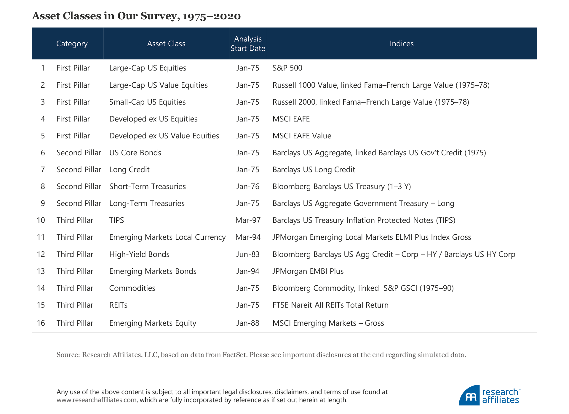
Our survey includes 16 asset classes and their index proxies. We break the asset classes into three categories, or pillars. The “first pillar” is mainstream developed-market equities, whose historical role in a portfolio has been to provide higher returns via participation in real economic growth. The “second pillar,” mainstream US investment-grade bonds, is intended to provide steady, reliable income in a portfolio—pretty anemic today!—and countercyclical dry powder available for investment when the economy and risk markets soften. The purpose of the “third pillar” is to diversify the portfolio and offer the ability to produce better returns than the other two pillars during inflationary periods. Why is inflation a specific function of the third pillar? Because inflationary bouts often lead to rising interest rates and tumbling stock market valuations, a combination that breaks down the complementary, diversifying characteristics of the first and second pillars.
We constructed an equally weighted portfolio that includes all 16 asset classes and a 60/40 portfolio consisting of 60% S&P 500 and 40% Barclays Capital US Aggregate Bond Index. Our survey begins in the first quarter of 1975 with 10 of the 16 asset classes from the first and second pillars and two of the third-pillar asset classes. We added new asset classes to the survey at the inception of their return histories. This gives us four full decades and a fifth stub decade, which comprises the second half of the 1970s. As a simple shorthand, we consider the return difference between the equally weighted portfolio and the 60/40 blend to be the return premium attributable to diversification.
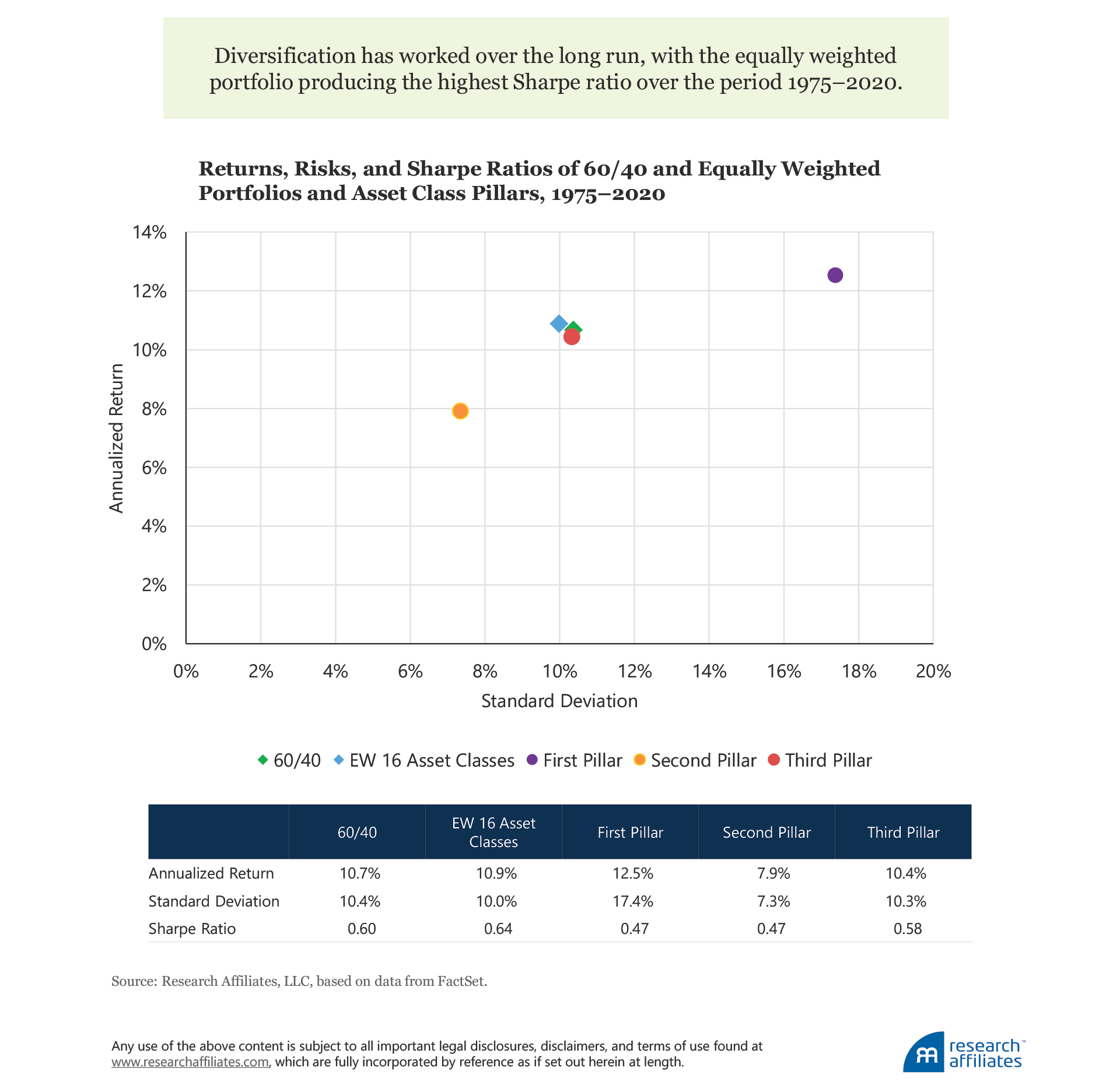
Since 1975, we see comparable results for the more-diversified equally weighted portfolio versus the 60/40 blend. The equally weighted portfolio produced a return of 10.9% a year with annual volatility of 10.0% and a Sharpe ratio of 0.64. The 60/40 blend earned an annualized 10.7% return with annual volatility of 10.4% and a Sharpe ratio of 0.60. If the diversifiers in the equally weighted portfolio can boost the Sharpe ratio of the 60/40 portfolio, certainly they must work even better if an investor just concentrates in these markets. Not so fast! The third-pillar asset classes boost the Sharpe ratio because they offer diversifying and complementary risks in the 60/40 investor’s portfolio.
We can make several high-level observations about the returns of each of the three pillars over the analysis period. The first pillar (essentially developed-market equities) and the second pillar (essentially US investment-grade bonds) produce identical Sharpe ratios of 0.47. The blend of the two pillars in the 60/40 portfolio boosts the Sharpe ratio to 0.60. The remaining third-pillar asset classes did slightly better by producing an annualized return of 10.4%, annual volatility of 10.3%, and a Sharpe ratio of 0.58, essentially matching the result for the 60/40 portfolio. We call attention to the following observations: the 60/40 portfolio has a higher Sharpe ratio than either of the broad stock and bond categories, which perform similarly on a risk-adjusted basis; the third pillar performs as well as the 60/40 portfolio; and the equally weighted portfolio, which combines all three pillars, improves the Sharpe ratio relative to both the 60/40 blend and the third pillar alone.
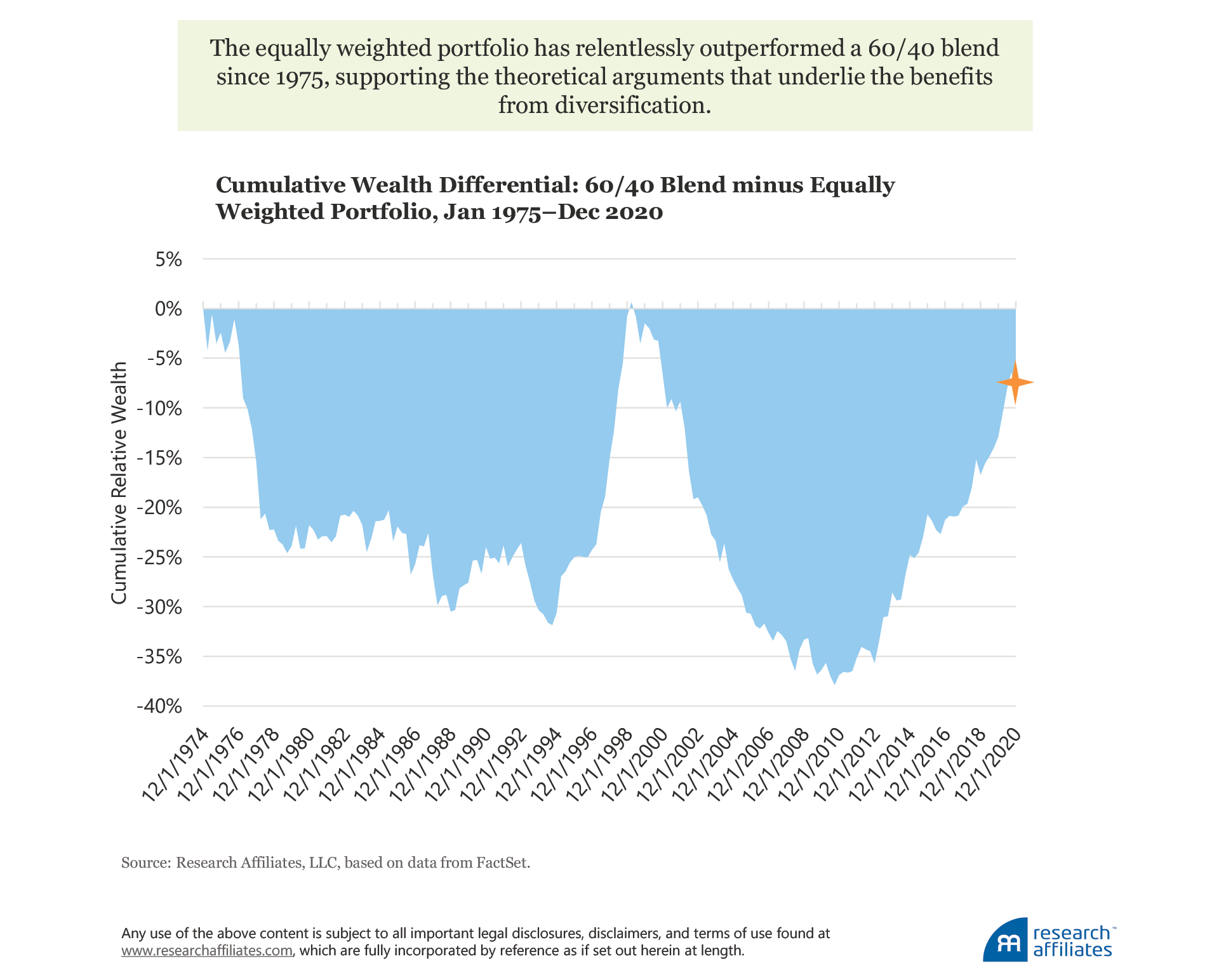
A very important observation is that the 46-year time span of our survey works in favor of the 60/40 portfolio because our analysis begins at the start of 1975, a bear-market low for both US stocks and bonds, and concludes at the end of 2020, a market high for both of these asset classes. Yet, the diversified equally weighted portfolio still outperforms the 60/40 blend. When we examine the relative performance of the two portfolios based on cumulative wealth creation, the equally weighted portfolio exhibits relentless outperformance over the 46 years. Since 1975, in only one quarter (of the 180 total!) did the 60/40 portfolio show a cumulatively larger value-add than its more-diversified competitor. Ever so briefly in the first quarter of 1999, the 60/40 portfolio caught up the equally weighted mix before falling off substantially. In other words, less than 1% of the history we examine shows a 60/40 strategy as producing superior long-term wealth.
Suppose an asset manager approached you with the recommendation to invest in a strategy that showed such relentless long-term underperformance, simply because the strategy had fared better over the last decade. Given the long history of underperformance, and the theoretical advantage of the diversified strategy, you’d laugh them right out of your life! But that recommendation is precisely what the current crop of diversification naysayers are proclaiming today!
We also looked further to determine how consistent this risk-adjusted edge was for diversification. Let’s call this a Sharpe ratio “hit rate.” We found that in 60% of rolling five-year windows the equally weighted portfolio produced a superior Sharpe ratio relative to 60/40. Collectively, this simple analysis suggests a modestly superior risk-adjusted result for diversification, even during a span in which the 60/40 portfolio benefited from sharply falling yields and rising prices. At a minimum, it is impossible to assert that a 60/40 strategy is superior based on long-term empirical results. So far, so good, for Harry Markowitz!
Decade by Decade
No investor has a 46-year window between portfolio formation and the portfolio’s first performance review. Indeed, precious few investors have even a five-year evaluation window; the typical performance assessment window is shorter. Therefore, it is unsurprising that the behavioral finance literature notes recency bias as one of the common cognitive errors besetting investors. Recency bias is the tendency to place greater emphasis on the recent past in forming expectations about the future. A related idea is the notion of how an investor’s experience affects her decision making through the tendency to form strong investment beliefs by overweighting personal experience over hard data. And finally, after an investor forms an opinion, confirmation bias encourages her to seek data that support her opinion, while ignoring data that suggest her opinion is wrong.
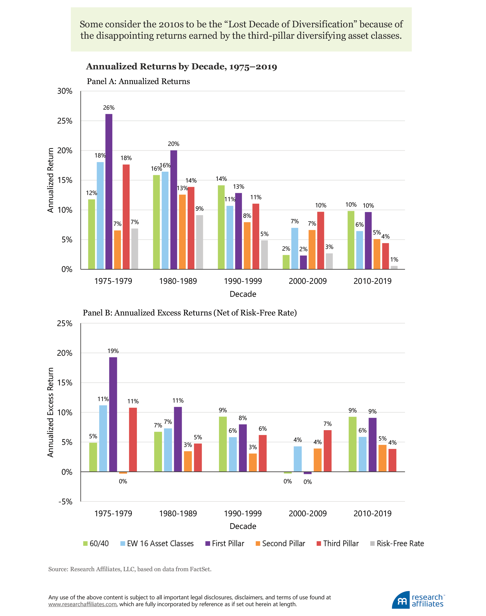
Keeping such behavioral tendencies in mind, let’s examine decade-by-decade results. For each decade and the stub decade, we calculated the nominal returns for each of the two portfolios and three pillars. We also calculated the returns of the 90-day US Treasury bill index, which reflects the prevailing risk-free rate, and thus can determine the realized excess return of each of the portfolios or pillars. The excess return allows us to compare more effectively the returns for an investor’s bearing risk across decades characterized by vastly different interest rate environments. A 7% return when the 90-day Treasury bill earned 6% is far less impressive than a 7% return when the same Treasury bill netted 1%.
Let’s start with the last decade, the 2010s. The equally weighted portfolio produced a nominal annualized return of 6.4%, the worst return of any of the decades, but its 6% excess return over cash was pretty typical of past experience. Indeed, the equally weighted portfolio has had remarkably steady excess returns over cash. Conversely, the 60/40 mix produced an annualized return of 9.2%, the implication being that the “cost” of diversification was nearly 280 basis points a year. Calendar-year 2020 brought even more pain to the diversified investor. After the dust settled on the nasty COVID-spurred sell-off and ensuing (and heroic) comeback rally, the 60/40 mix produced a return of 15.4% versus only 9.5% for the equally weighted mix. If we add 2020 to the last decade, 11 years of compounding substantially increases the annualized delta. An investor with $100,000 at the beginning of 2010 would have a balance of $294,000 at year-end 2020 if invested in the 60/40 portfolio versus an ending balance of $204,000 if invested in the equally weighted portfolio over the same period. Because the 60/40 portfolio anchors on US large-cap stocks (specifically, the S&P 500), which soundly beat US small-cap and international stocks over the 11-year period, the 60/40 portfolio even edges out the all-equity first pillar, because it equally weights US large- and small-cap and EAFE stocks.
What created the relative performance drag in the equally weighted portfolio over the last decade? The answer is the third pillar—those assets whose role is to provide diversification away from equities’ performance. In the 2010s, these asset classes combined to produce a 4.4% annualized return. No wonder some consider the 2010s to be the “Lost Decade of Diversification.” It was! And it continued in 2020 with a measly 5.8% one-year return.
Now, let’s look back further to the decade of the 2000s. We observe the opposite performance comparison: the equally weighted portfolio with a 7.0% nominal return outpaced the 60/40 blend’s paltry 2.4% annualized return. Mainstream US stocks entered the period with historically high (nosebleed?) valuations and experienced two horrific bear markets during the decade. Meanwhile, third-pillar diversifiers fared far better than mainstream stocks. Over this decade, diversification paid off. (Later in the article, we will address how valuations fared over our survey period.)
Particularly interesting, however, is a comparison of excess returns, because they allow us to assess more effectively the returns for bearing risk across decades with vastly different interest rate environments. We see that the excess return of the equally weighted portfolio in the 2010s (5.9%) meaningfully exceeded its excess return in the 2000s (4.3%). In other words, the disappointment with diversification over the last decade was relative, not absolute!
We’ve seen this movie before. In the decade of the 1990s, the equally weighted excess return was almost 6.0%, practically identical to the experience in the 2010s. This excess return—nothing to scoff at—was indeed the aspirational excess return of many an absolute-return strategy in the 1990s and since, but the 1990s also produced a 9.3% excess return for the 60/40 portfolio. Compared to an excess return of 5.9%, the equally weighted portfolio’s achievement paled by comparison. Accordingly, both of us can state from our personal experience sitting in boardroom “hotseats” that this achievement was viewed with contempt by the end of the 1990s, given the 60/40 portfolio’s stupendous results.
We might choose to dismiss this relative-performance fixation and the resulting disappointment in otherwise excellent performance—indeed a diversified portfolio will always be underperforming “something.” It only becomes a problem when that something is an investor’s core holdings, typically resembling a 60/40 blend. We freely acknowledge that the gravitational pull of the peer group and its bias toward the “normal” 60/40 portfolio is a powerful reality for advisors and institutional investors alike. Indeed, one of us (Rob) noted this trade-off in 2003, writing in the Financial Analysts Journal:
Suppose in 1988 we found an absolute-return strategy that outpaced U.S. T-bills by 6 percent—each and every year…. Despite higher returns and less risk than a 60/40 portfolio, it underperformed the 60/40 asset mix in six consecutive three-year spans, so it also would probably have been abandoned long before the end of 2000.… Isn’t there something wrong with this picture? (p.4)
Little has changed since then. Indeed, human happiness appears to center not on absolute success relative to our own expectations, but to our neighbor’s success. Take the study by economists Sara Solnick and David Hemenway in which they surveyed 257 students, staff, and faculty at the Harvard School of Public Health on their attitudes about absolute position and their position relative to society (Solnik and Hemenway, 1998). Half of the respondents preferred to receive an annual salary of $50,000 when others are making $25,000 than to earn $100,000 a year when others are making $200,000. In other words, the respondents would prefer to have half as much real income as long as they are making twice as much as others. We have noted a similar response from investors during our careers. Clients appear to be pleased when our strategies delivered low returns or even losses as long as the excess returns were high relative to peers’ returns, identical to Solnick and Hemenway’s conclusion.
The Path to Diversification Disappointment
Over the last four decades, the equally weighted portfolio’s excess returns over cash have been fairly consistent, with a low of 4.3% during the 2000s and a high of 7.3% in the 1980s. While no strategy can produce consistent 6.0% excess returns above cash, the equally weighted portfolio has done a fairly good imitation of a constant 6% excess return! In contrast, the 60/40 portfolio has had wider swings, underperforming the risk-free rate in the 2000s and producing stupendous excess returns, over 9%, in the two decades of the 2010s and 1990s. What is the root cause of these swings, and how can understanding the cause help us form expectations for the future?
Let’s start with a trivial, but important observation. The equally weighted portfolio of 16 asset classes means no single exposure is likely to dominate our results. Simple arithmetic translates to an exposure of 6.25% per asset class (which we rebalance quarterly in our analysis). Even though we combine related and highly correlated asset classes, such as US large-cap, US large-value, and US small-cap stocks, we still arrive at less than 20% of the portfolio in US stocks and less than 50% in equities worldwide. Conversely, the 60/40 blend holds 60% in a single asset class, US large-cap equities represented by the S&P 500. Intuitively, we can infer that large deltas between the portfolios are likely driven by the return of US equities.
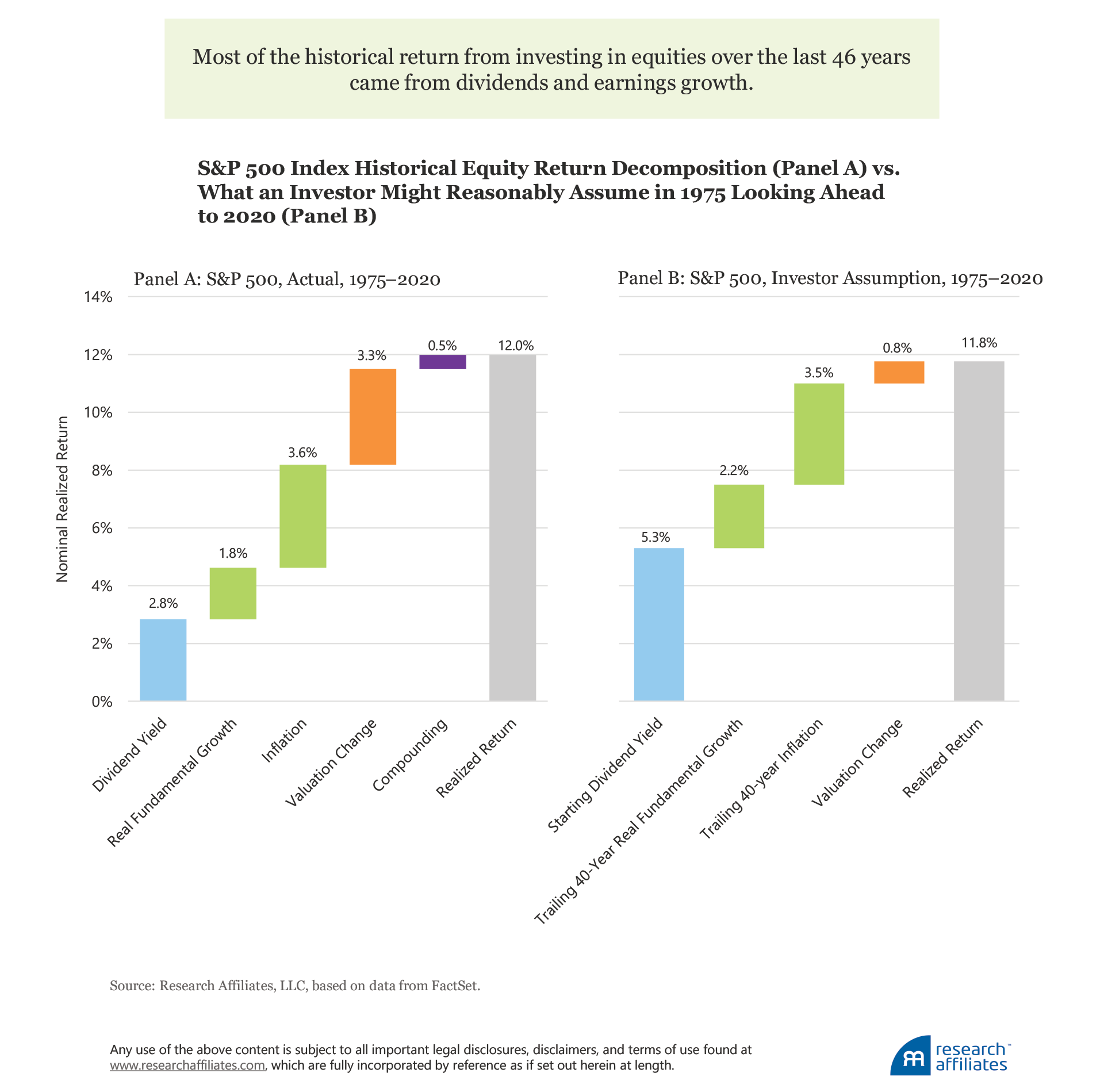
To explore further, we can start with an equity return decomposition consistent with the forecasting methodology that underpins our Asset Allocation Interactive (AAI) web tool.5 We break down the 12.0% US large-cap equity market return, proxied by the S&P 500, from the start of our analysis in 1975 into the categories of yield, growth, and change in valuation. Most of the historical return from investing in equities came from dividends and earnings growth. Dividends contributed 2.8% a year. Growth contributed 5.4% to the nominal S&P 500 return, with real fundamental growth at an annualized 1.8% and inflation at an annualized 3.6%. Jack Bogle referred to dividends and growth as the sources of the “return to the investor,” that is, what an investor receives as a buy-and-hold owner of a business.
Conversely, valuation changes reflect the price investors are willing to pay for a business, and in the case of the S&P 500, for 500 businesses. Over extraordinarily long horizons, these valuation changes tend to be a very small contributor to overall stock market returns. Since 1870, the 150-year gradual rise in valuation multiples added 0.7% a year to US stock market returns. Over the 46-year time horizon of our survey, however, which encompasses most current investors’ entire personal experience in the capital markets, the number is substantially higher at 3.3% a year, nearly five times valuation’s contribution over the last 150 years. At the beginning of 1975, valuations were very low. At the end of 2020, valuations were in the top 2% of historical observations. The amount of the change in valuation can fluctuate wildly over shorter 10-year periods, which led Jack Bogle to label this component of return as the “return to the speculator.”
So, S&P 500 investors had an excellent run over the past 46 years. Should they have expected it based on 1975 observable conditions? The answer may surprise you. In 1975, the dividend yield stood at 5.3%. We estimated the next two components, just as the 1975 investor would have been able to do. Using the trailing 40-year results (i.e., 1935–1974) of the S&P 500, we estimated the components of future growth to be real fundamental growth at 2.2% annualized and inflation at 3.5% annualized.
We estimated the speculative component, the change in valuation, as follows. In 1975, the Shiller cyclically adjusted price-to-earnings (CAPE) ratio stood at 8.3, well below the long-term average to that point, which was 15.2. Our AAI forecasting methodology assumes the valuation ratio will mean revert halfway to the historical average, a tacit acknowledgement that “it’s different this time” and that historic averages may not be “fair value.” Over the next 46 years, a halfway-to-historic average reversion takes us to an estimate of 11.8, a gain of 42% as the valuation ratio increases from 8.3 to 11.8. Over the next 46 years, the estimated gain would translate into a 0.8% a year return from the change in valuation. Adding these components gives us a remarkably similar result—an expected 11.8% versus a realized 12.0%!
The difference between realized and estimated returns for the period were the contributors to the return. Namely, dividends contributed far less and valuations far more in the live experience. These sources of return are two sides of the same coin. Since 1975, interest rates declined substantially, and dividend yields followed suit. Valuations, the reciprocal of yields, rose far more than forecast.
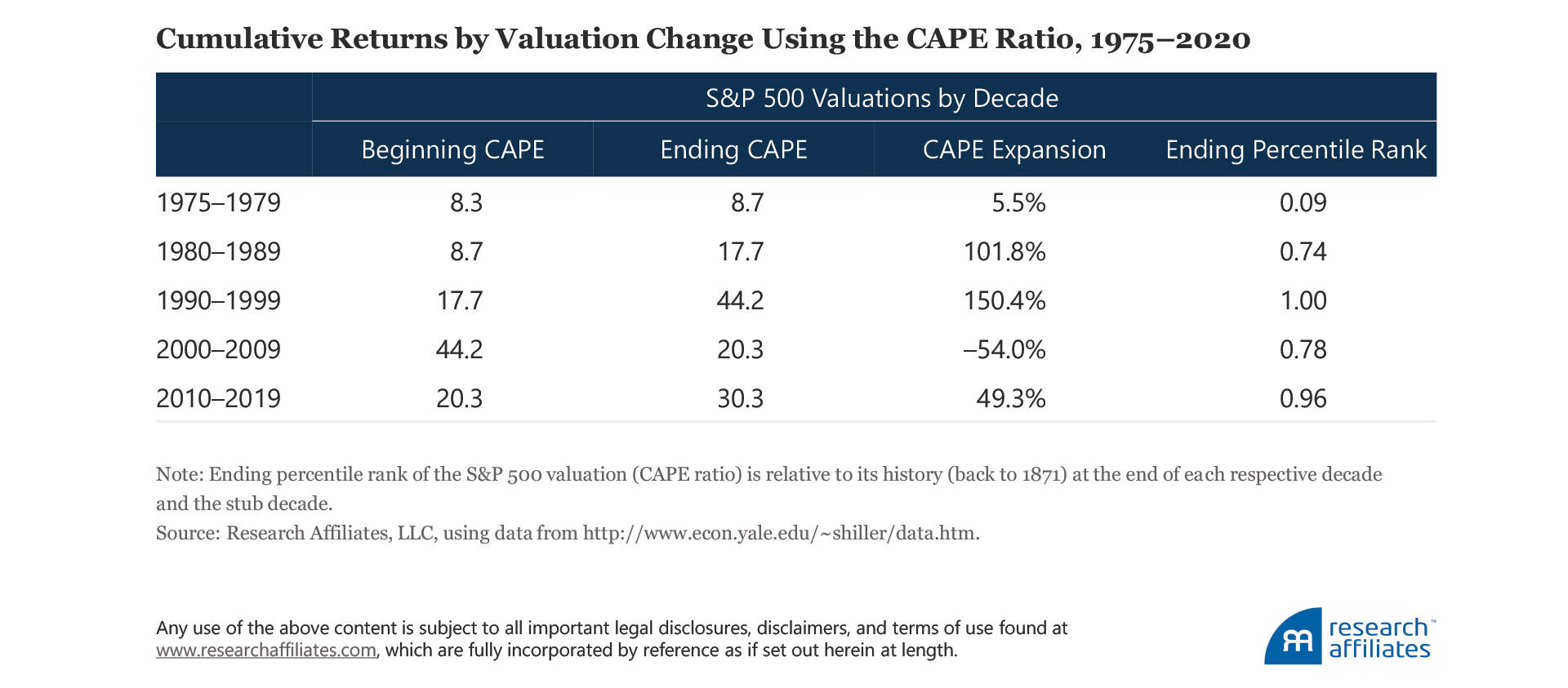
The valuation (CAPE ratio) of the S&P 500 did not end 2020 at 11.8, and its path since 1975 was far from linear. Speculation—guessing what someone will pay for an asset in the future—played a role in that meandering path. Let’s look at how valuations have fluctuated since 1975, especially over the decade-by-decade spans that sear into our minds, occasionally leading us to draw incorrect conclusions.
We can deduce the return to the speculator by simply taking the cumulative difference in percentage terms of the beginning and ending CAPE ratios for each decade.
The two worst decades for diversification were the 1990s and the 2010s. Both coincided with immense bull markets in US stocks with valuations at peak or near-peak levels. Diversifiers, even faring well, could not keep pace. In December 1999, the S&P 500 CAPE ratio reached an all-time high of 44.2. Twenty years later, at year-end 2019, the S&P 500 CAPE ratio was over 30, ranking in the most expensive 4% of historical observations. What happened in 2020? During the COVID sell-off, the CAPE ratio ever so briefly dipped to 24.8 before rocketing back to the stratosphere and ending December 2020 at 33.5, ranking in the top 2% of historical observations. So, even though the decade of the 2020s started with a high CAPE, it vaulted higher by roughly another 10%.
For the decade of the 2020s to be able to repeat the experience of the preceding decade and post a 50% rise in US equity valuations, the CAPE ratio would need to increase another 40% over the next nine years to hit the unprecedented level of 45, exceeding the dot-com valuation peak of 44.2. Can this happen? Of course, but relying on it to happen would not be a prudent strategy.
If we extrapolate the past decade to form expectations of absolute and relative superiority of a 60/40 strategy, a rise in valuations of this magnitude becomes our baseline. In other words, speculation leading to rising prices becomes an expectation. Importantly, expectations are a midpoint, meaning that half the observations are above the expectation and half below. Investors who extrapolate such a rise in the CAPE ratio must have half of their observations at higher-than-peak levels of 2000! Prognosticators using the recent decade-plus to “prove” a 60/40 strategy is superior to more-diversified approaches need to be mindful that rising S&P 500 valuations played a meaningful role in this win.
Looking Forward
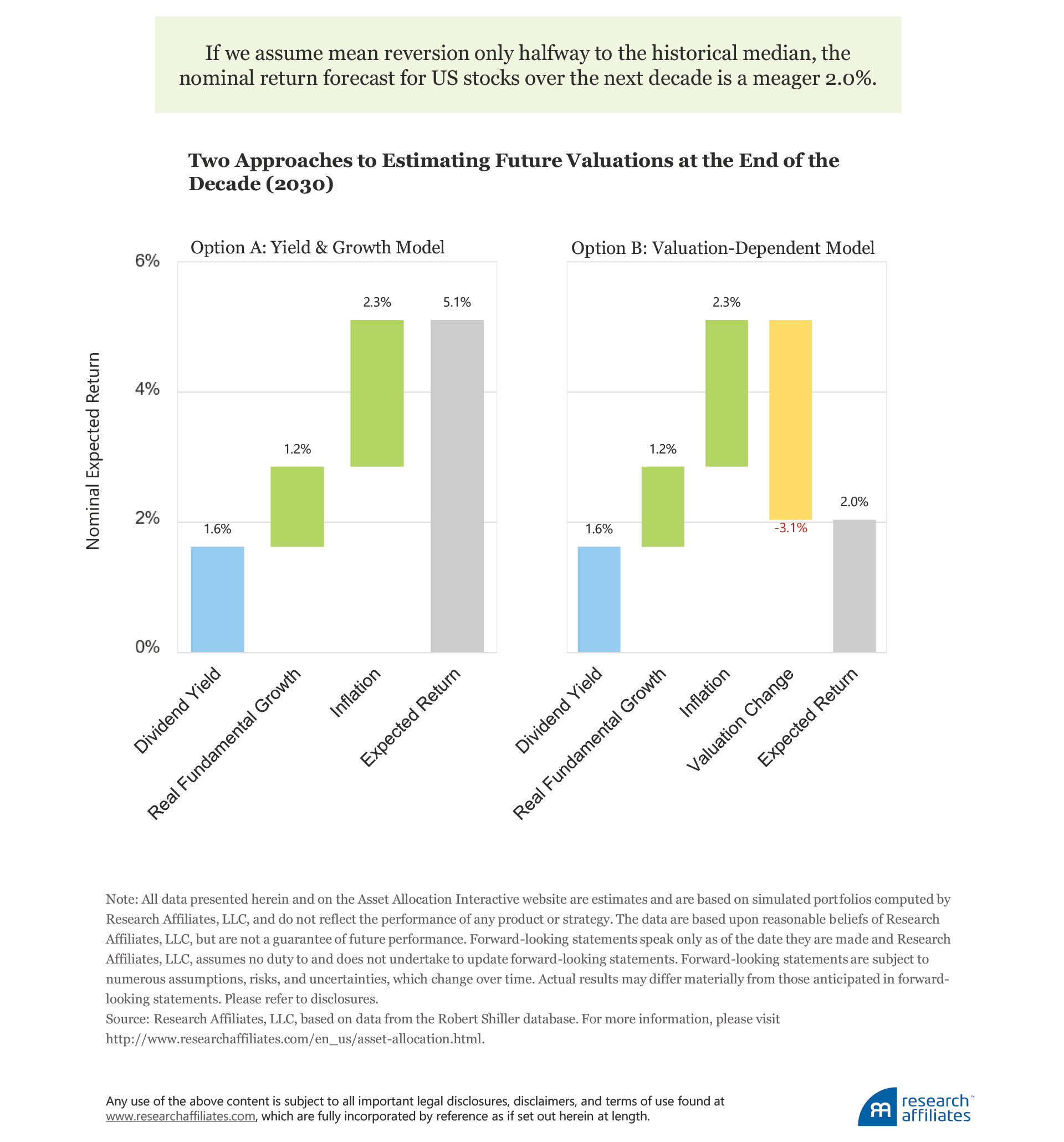
What might we reasonably expect on the investment front over the next decade? Our AAI web tool provides readily available long-term forecasts for over 130 assets and model portfolios, estimated using a conceptual framework that is transparent and robust. The dividend yield on US large-cap stocks is observable today and is far from both the 5.3% yield witnessed at the start of 1975 and the cumulative dividend return of 2.9% since 1975. As of December, 31, 2020, the dividend yield is 1.6%. Our estimate of real fundamental growth is 1.2%, much closer to the long-term average since 1871 as identified by Arnott and Bernstein (2002). Our inflation estimate is 2.3%. This leaves us with the big, speculative wildcard—the change in valuation over the next decade.
We can estimate future valuations from two distinct angles. Option A assumes that current valuations are “fair,” so that by the end of the next decade we would end up precisely where we are starting today. The second approach, Option B, assumes some mean reversion in valuations, but not all the way to the historic average. Suppose, following the same method we used to estimate the expected change in valuation from 1975 to 2020, we assume mean reversion halfway to the historic average.
If we assume that valuations remain elevated at today’s level (Option A), we arrive at a nominal rate of return for the S&P 500 of 5.1% (as of December 31, 2020). On AAI we label this the Yield & Growth expected return model. If, however, we assume some mean reversion (Option B), things get hairy. If we assume the S&P 500 CAPE ratio falls from 33.5 to 24.6—halfway back to the historic average/median of 16.3—our 10-year nominal forecast falls to 2.0%. A CAPE ratio of 24.6 would fall in the 86th percentile of historic observations and just a shade below its 20-year average of 25.5. Note that we are not talking about a draconian assumption of 1970s’ single-digit multiples! In a later paper, we will explore how remarkably well the simple arithmetic we use here can predict long-term performance for many global asset classes.
Even Asset Allocation “Clairvoyance” Can Lag
When equity valuations rise to peak levels, our experience shows that asset allocation management comes under considerable pressure. Rob has been an asset allocation practitioner since the early 1980s, using models to gauge the attractiveness of assets in order to over- or underweight them in a portfolio. As a thought experiment, we developed, with the obvious benefit of hindsight, a “clairvoyant diversification” portfolio. Every three years, the clairvoyant diversification portfolio looks into the future and invests equally in the top 25% of asset classes that will in fact be the best performers over the next three years. In the 2000s and 2010s, this generally meant the four best asset classes, because for the majority of those years the survey universe included 16 asset classes. In the 1980s and 1990s, a clairvoyant investor would have chosen the three best asset classes, because for the majority of those years the survey universe had only 12 asset classes. In the 1970s, the clairvoyant diversification portfolio was composed of only two or three asset classes.
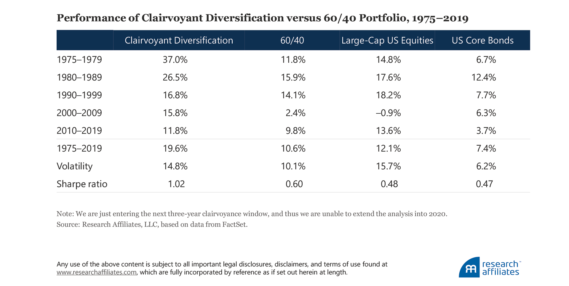
To state the obvious, clairvoyance is obviously not achievable. Nevertheless, please bear with our thought experiment. Over the entire 45-year period ending in 2019,6 clairvoyant diversification produced some amazing results, exactly as we would expect. The portfolio compounded annually at nearly 20%—for 45 years! Volatility was fairly high at 14.8%, just under the volatility of the S&P 500 (15.7%), for two reasons. First, the best performing asset classes over any three-year span are typically the riskier ones with the same often true of the worst performing asset classes, because the riskier markets tend to occupy the extremes in performance. Very rarely do we see low-risk assets, such as short-term Treasuries or core bonds, finish in the top-performing 25% of assets over a three-year period.
Second, we are by definition forgoing diversification by concentrating in the top three or four subsequent outperformers, which leads to higher risk. Nonetheless, the clairvoyant diversification portfolio is more than compensated for this risk with a Sharpe ratio of over 1.0, easily surpassing the risk-adjusted figures of the equally weighted and 60/40 portfolios. Realized long-term Sharpe ratios above 1.0 are an exceedingly rare occurrence in the investment management industry, although they remain routine in the world of backtests (and Madoff-style fraud)!7
When we break out returns for clairvoyant diversification by decade, we witness breathtaking outperformance in the late 1970s, the decade of the 1980s, and the decade of the 2000s. In the 2010s, the S&P 500 produced an annualized 13.6% return, outperforming clairvoyant diversification by 1.8% a year—even clairvoyance couldn’t beat the S&P juggernaut! The same occurred in the 1990s when the S&P 500 beat clairvoyant diversification by 1.4% a year. In both cases, over a “long-term” 10-year span, a single asset class beat a portfolio of the three or four best performing asset classes, re-selected every three years to ensure the portfolio was always investing in the winners.
Finance theory and consultants recommend diversification because no one can predict the future. But even if we could, we would have still underperformed the S&P 500 in the 1990s and 2010s. What a pity the run was interrupted by the orst decade for 60/40 in the past half-century!
Conclusion
Many of us in the investment management business are fiduciaries, those entrusted with watching over and prudently administering our clients’ money and assets. Even those professionals who do not have a legal fiduciary obligation have a deep-seated desire to do right by their clients. It’s hard work. Capital markets are inherently uncertain and require substantial holding periods for even “proven” strategies to earn their anticipated returns. When, as investors, we encounter disappointment, we first need to ascertain if the performance results are unusual or implausible. We can then make a more informed judgment as to whether to extrapolate these results into the future or to expect benefits from mean reversion.
By definition, investors who use the last decade-plus or even the last 30 years—in which two of the three decades ended at peak equity valuations and a perfectly clairvoyant GTAA strategy was unable to keep pace with US stocks—to project the continued superiority of a 60/40 strategy over more-diversified approaches are tacitly relying on prices to rise ever higher. Can we really count on another round of speculative good fortune—indeed, to trust that continued escalation in valuations will successfully serve trillions in future pension obligations? If not, now is not the time to abandon diversification and diversifying asset classes. Certainly, if mean reversion does occur, heeding the lessons of the 2000s we must acknowledge that diversification is needed today more than ever.
Please read our disclosures concurrent with this publication: https://www.researchaffiliates.com/legal/disclosures#investment-adviser-disclosure-and-disclaimers.
Endnotes
- In the video “Forging the Frontier” on the Research Affiliates website, Harry Markowitz provides more background on his journey to becoming the “Father of Modern Portfolio Theory.”
- According to the website QuoteInvestigator, this quote first appeared in the Yale Literary Magazine in 1882.
- Most readers will be shocked to learn that the final benefit payment from the Civil War was paid to the disabled daughter of a veteran of that war in May 2020, 155 years after the end of the war (Miller and McCarthy, 2020), and that the last spousal pension check from the Revolutionary War was paid in 1906, 131 years after the pension had been earned (Harrell-Sesniak, 2012).
- The economic expansion ran from June 2009 until February 2020, and the bull market was even longer, running from March 2009 until February 2020. The last complete market cycle, peak to peak, lasted from October 2007 until February 2020.
- “Equity Methodology Overview,” available on the Research Affiliates website, offers an opportunity for a deeper dive into the underlying theory of our Asset Allocation Interactive web tool.
- We are just entering the next three-year clairvoyance window, and thus, we are unable to extend the analysis into 2020.
- Sadly, Sharpe ratios above 1.0 are an all-too-common occurrence in the confined world of backtesting. Arnott, Harvey, and Markowitz (2019) provides more detail on the dangers of backtests. Even realized Sharpe ratios above 1.0 require serious due diligence as Madoff investors learned the hard way.
References
Arnott, Robert. 2003. “Managing Investments for the Long Term.” Financial Analysts Journal, Editor’s Corner, vol. 59, no 4 (July):4–8.
Arnott, Robert, and Peter Bernstein. 2002. “What Risk Premium Is ‘Normal’?” Financial Analysts Journal, vol. 58, no. 2 (March/April):64–85.
Arnott, Robert, Campbell R. Harvey, and Harry Markowitz. 2019. “A Backtesting Protocol in the Era of Machine Learning.” Journal of Financial Data Science, vol. 1, no. 1 (Winter):64–74. Also available on SSRN.
Harrell-Sesniak, Mary. 2012. “Last Revolutionary War Widow Receives Final Pension—in 1906!” GenealogyBank.com (July 19).
Miller, Ryan, and John McCarthy. 2020. “Last Person to Receive Pension from Civil War, $73.13 Monthly, Dies at Age 90.” USA Today.com (June 10).
Research Affiliates. 2014. “Equity Methodology Overview.” Research Affiliates.com.
Solnick, Sara, and David Hemenway. 1998. “Is More Always Better? A Survey on Positional Concerns.” Journal of Economic Behavior & Organization, vol. 37, no. 3:373–383.
West, John, and Amie Ko. 2017. “The Most Dangerous (and Ubiquitous) Shortcut in Financial Planning.” Research Affiliates Publications, Advisor Series (September).
