
The CAPE (cyclically adjusted PE) ratio is not a useful timing signal for market turning points, but is a powerful predictor of long-term market returns.
Many arguments have been offered to justify elevated CAPE ratios. Most or all of the factors underlying these arguments are inherently temporary and subject to either near-term or eventual mean reversion. Beware the consequences of assuming that elevated CAPE ratios are here to stay, but if they are the “new normal,” low future returns will be as well.
We can have a spirited debate about whether the equilibrium US CAPE ratio is 16 or 20 or a notch higher. But at 32 times 10-year average earnings, no matter what adjustments we make, the US market is expensive.
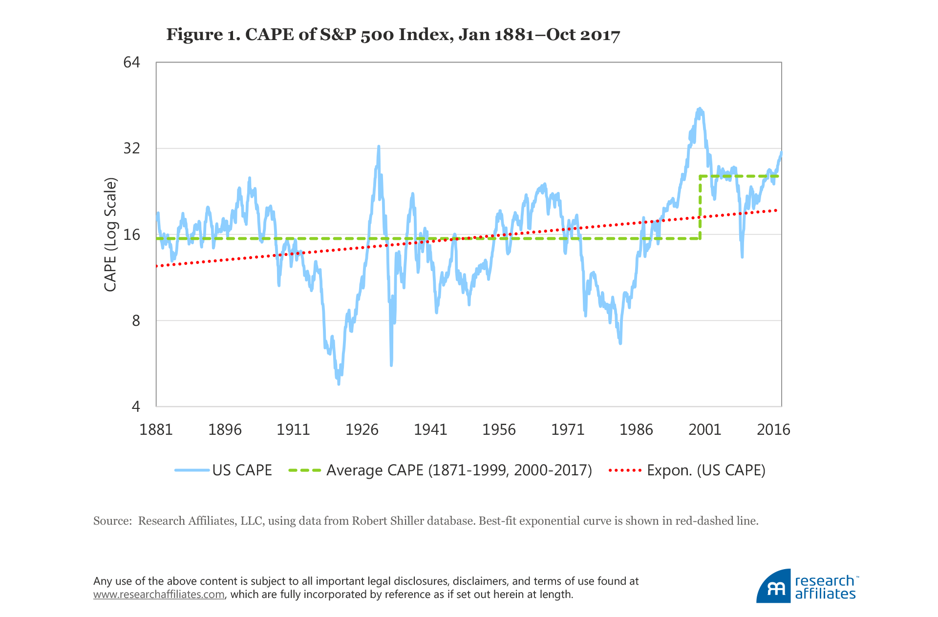
US CAPE (cyclically adjusted price-to-earnings, or Shiller PE) ratios are at levels previously reached only in 1929 and during the tech bubble. In the fall of 2017, the US stock market surpassed a CAPE ratio of 32, nearly double its long-term historical norm of 16.6. Whenever the Shiller PE suggests caution, CAPE skeptics abound, explaining why we should turn away from the warnings of a high CAPE ratio. Should we fear the lofty valuation multiples, or should we fear the CAPE ratio itself because of its notorious unreliability in picking market peaks and troughs?
Jeremy Grantham—until now, a vocal advocate of caution when CAPE ratios are stretched—argued recently “this time seems very, very different” because current high CAPE ratios are supported for structural reasons, reflecting high earnings growth rates driven by “increased monopoly, political, and brand power” (2017, p. 16). Our view is that Grantham’s arguments explain high past earnings growth, and may be relevant for near- to mid-term valuation levels, but are far less informative about future growth rates.
Several additional factors, such as low real interest rates and low volatility in GDP and in inflation rates, can also support elevated equilibrium CAPE ratios. None of these arguments offers any reasonable hope that the US stock market can deliver long-term returns in line with historical norms. Most of these factors drive equilibrium valuation levels higher through a lower discount rate, which suggests low expected returns for many years to come, even without any mean reversion in the CAPE ratio. Each of these factors is likely to be temporary; if the rationale for high multiples goes away, then we’ll get mean reversion in CAPE, possibly as a severe market downturn. Moreover, CAPE naysayers tend to focus on the reasons CAPE could remain high, and overlook the reasons related to demographics and rising inequality that could cause US CAPE to fall.
Finally, these same arguments in favor of a high CAPE would also justify high multiples in many other countries, and yet when we examine valuation ratios—CAPE ratios and others—in non-US developed and emerging markets, we find most non-US markets are far less expensive than the US stock market based on almost any measure we use, and more important, the spread has rarely been wider. Investors ignore the warnings of high US CAPE ratios at their peril.
Is CAPE Permanently Elevated?
Since 1996, the US CAPE ratio has been above its long-term simple average (16.6) 96% of the time, and above 24, roughly one standard deviation above its historical norm, more than two-thirds of the time. This dislocation is long enough to make even the most ardent fans of CAPE, such as Jeremy Grantham at GMO and our team at Research Affiliates, take pause. Grantham, whom we greatly admire for his courage and investment acumen, famously announced in late May 2017 that high valuations are here to stay, offering an affirmative answer to the question: Is the tried-and-true hammer of value investors—comparing CAPE to its historical statistics—broken?
We believe the correct answer is far more nuanced than a simple “yes.” Most of us who use CAPE as a valuation tool readily accept that CAPE is only one measure of valuation, and that—as American investor Stan Druckenmuller likes to point out—capital flows drive short-term market behavior far more powerfully than valuation. Going back to the early 1990s, one of us (Arnott) has always preferred to show historical CAPE as an upward-sloping best-fit line (the red dashed line in Figure 1) in tacit acknowledgment that its equilibrium1 level is not static, and that it should rise as the US market matures and becomes more efficient. Let’s not forget that in 1881 the United States was an emerging market by modern standards!
The best-fit line for US CAPE, a simple view of the measure’s evolving estimation of fair value, starts at about 12x in 1881, when the nation was still an emerging market, and finishes at about 19x in October 2017. CAPE’s imprecision is illustrated by its always exceeding the estimated fair-value trend line over both the first quarter-century and the latest quarter-century, except briefly in 2008–09. Grantham’s is also a simple view (we doubt he’d disagree), illustrated by the step function of the green dashed line in Figure 1 (Grantham, 2017); before the mid-1990s, the normal valuation was in the mid-teens, and in the mid-twenties thereafter.
International Evidence for CAPE Efficacy
The CAPE ratio is a powerful predictor of stock market returns, and its forecasting efficacy in the US market is amply explored and documented in the literature. (More information on why CAPE forecasts returns is provided in the appendix.) We take a look beyond the US market at CAPE’s ability to predict 10-year returns in 11 international stock markets, where its efficacy is not as well documented. Because CAPE is easy to calculate across global markets, it provides a consistent mechanism for cross-market comparisons.
But first, let’s examine CAPE’s efficacy in the US market over horizons of 1 to 20 years. In Figure 2 we compare the starting CAPE ratio with the S&P 500 Index return at each 1-, 5-, 10-, and 20-year horizon beginning in 1881 through October 2017.2 The scatter plot in Panel A illustrates that the CAPE ratio does forecast return, even on a short horizon of 1 year, although the forecast has considerable uncertainty.3 Indeed, if the regression line wasn’t shown in Panel A, it would be difficult to discern any relationship at all. Although the short-term efficacy isn’t bad—the regression slope is steeper than for any of the longer spans—the dispersion is wide, with factors other than valuation driving short-horizon performance. As the horizon increases from 5 to 20 years (Panels B to C to D), the forecast becomes more predictive as the dispersion narrows considerably, making it easy to see why CAPE is such a popular tool for practitioners who want to gauge long-horizon market prospects. The fit is impressive enough that CAPE skeptics have some explaining to do.
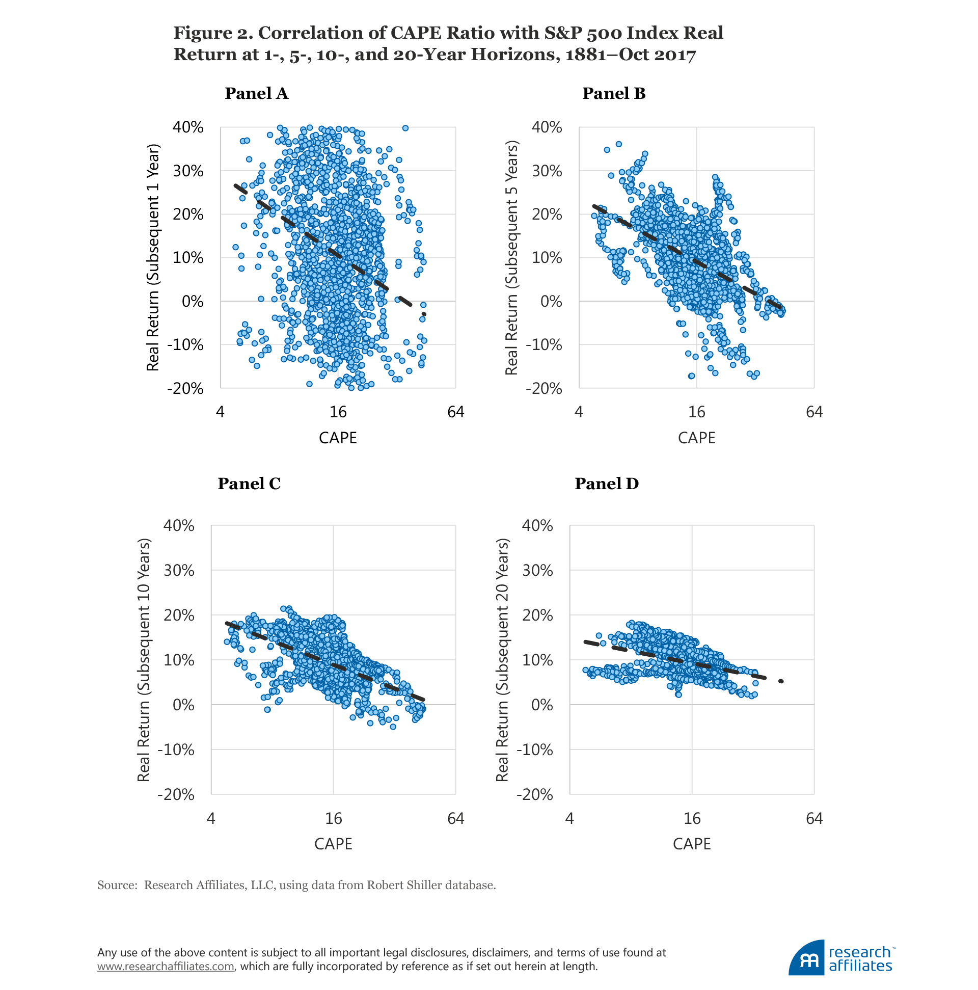
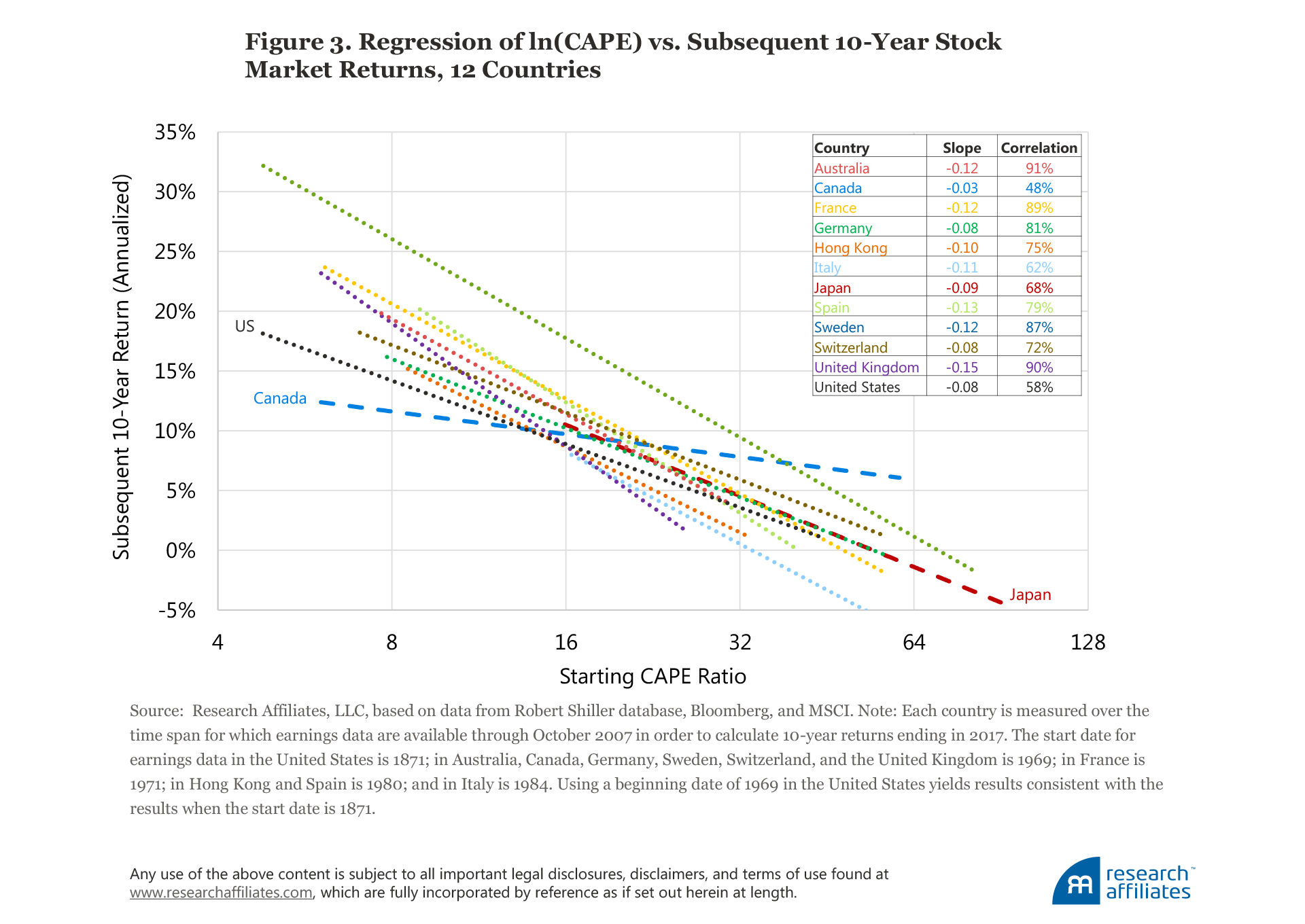
Figure 3, which expands our analysis beyond the US market, offers a different perspective on the efficacy of the CAPE ratio. We produced scatter plots—much like the graphs in Figure 2—comparing the starting CAPEs of 12 developed stock markets and the markets’ respective 10-year returns. Figure 3 leaves out the cloud of plot points, but shows the regression line for each of these countries. With the exception of Canada, they all bear a remarkable resemblance. Canada may not necessarily be “different”; it may simply be a random outlier that we would find in any distribution. The average slope of the 12 regression lines is −0.08, meaning that for each 1% increase in CAPE, the annualized return over the next 10 years falls by 8 basis points (bps). Put a different way, a move from 20 to 21, a 5% increase, lowers the total 10-year expected return by 4%.
CAPE Skeptics’ Arguments
Comparing the CAPE ratio from 1960 to today is like comparing Oscar Robertson to Russell Westbrook. Same game, but things have changed.
—Michael Batnick, CIO, Ritholtz Wealth Management (2017)
As Jeremy Grantham and other investors have pointed out, over the last quarter-century the US CAPE ratio has remained unusually high relative to history. As a result, CAPE zealots have missed much of the bull markets of the 1990s, 2002–2007, and 2009–2017. Given the popularity of CAPE, many observers have suggested new ways to interpret the measure, and some have offered adjustments that ostensibly help CAPE serve as a better gauge of value. Others suggest that we disregard CAPE entirely—CAPE fear, indeed!
Several possible explanations for a sustained elevation in CAPE ratios include:
- Structural changes in earnings per share (EPS) growth. Higher structural growth in EPS justifies a higher equilibrium CAPE ratio. Grantham (2017) makes this argument.
- Demographics. A soaring roster of working adults approaching retirement age can become valuation-indifferent buyers of financial assets in order to have future resources to buy goods and services in retirement. We have made this argument (Arnott and Chaves, 2012 and 2013).4
- Real interest rates. Low real interest rates can mean a lower discount rate, providing higher valuations for any risk-bearing financial assets, unless those low real interest rates are also predicting abnormally slow earnings growth.
- Risk in macroeconomic measures and in financial assets. The volatility of financial assets is at near-record lows, as is the volatility of the macroeconomy when measured by the volatility in gross domestic product (GDP) and in CPI inflation. If risks are lower, then the risk premium should be smaller. A lower risk premium means a lower discount rate, which means higher valuation levels.5
Each of these explanations has merit. But do they necessarily imply higher expected returns?
To answer this question we can use the dividend discount model that motivated the creation of CAPE. (A brief overview of the theoretical framework and history of the CAPE ratio is provided in the appendix.) We suggest three reasons why CAPE, measured at any point in time, can deviate from its historical norm:
1. Changes in the future EPS growth rate;
2. Inaccuracies in earnings measurement; and
3. Changes in the discount rate (and therefore changes in the expected rate of return).
If CAPE is high due to high future EPS growth expectations or is high due to mechanical imprecision in earnings measurement because past earnings are artificially depressed, and hence less indicative of future cash flows, then a high CAPE ratio is fully compatible with high expected future returns.
If CAPE is high due to a low discount rate, then a high CAPE would be associated with lower returns. High CAPE valuations do not need to tumble, to mean revert toward historical norms, in order to deliver lower returns. When discount rates are low, then expected future returns are low, even if valuations remain permanently elevated. The investor has simply paid a high price for future cash flows, and the future return will likely be lower than the historical norm.6
Let’s examine the most common arguments used to dismiss the dangers of a lofty CAPE ratio.
Changes in the Future EPS Growth Rate
Grantham (2017) points out that US corporate profitability is very strong today. Both profit margins on sales and the ratio of corporate profits to GDP have been rising. He notes that strong profits are being driven by US companies’ greater monopolistic power, both domestically and abroad. Globalization has disproportionately benefitted US companies, allowing them to better leverage their brands. Further, increased political power of US enterprises in foreign markets has allowed them to reduce regulation in many industries and to squeeze unions into irrelevance. Finally, Grantham observes that much lower (and falling) interest rates, together with higher leverage since 1997, have also boosted US profitability. These are very sound reasons to explain high past EPS growth.
We agree that US corporate profits have been very strong lately and are beginning to regain the heights reached in 2014.7 The CAPE denominator has experienced an upward revaluation from higher profits that seems to reflect a “new normal” of higher profit margins. But should higher profits also boost the multiplier?
We question how past earnings strength is relevant to the CAPE ratio. The CAPE ratio should benefit only if the recent acceleration in earnings growth heralds continued outsized earnings growth for US companies, sustainable on a long-term basis. Assuming this will be the case could be dangerous because history suggests that fast earnings growth presages slower, not faster, earnings growth. Furthermore, an expectation that earnings will outpace real growth of GDP in the long term, especially when the latter has been disappointingly low during the most recent recovery, is difficult to understand.
In a nutshell, we think Grantham’s thesis is right on target in discerning the reasons for the past surge in corporate profits as a share of GDP. Real earnings of the S&P 500 peaked in 2014 and have yet to exceed that level, so Grantham’s earnings surge may already have run its course. We are skeptical that earnings can grow much in the years ahead, relative to GDP, without causing a populist backlash.
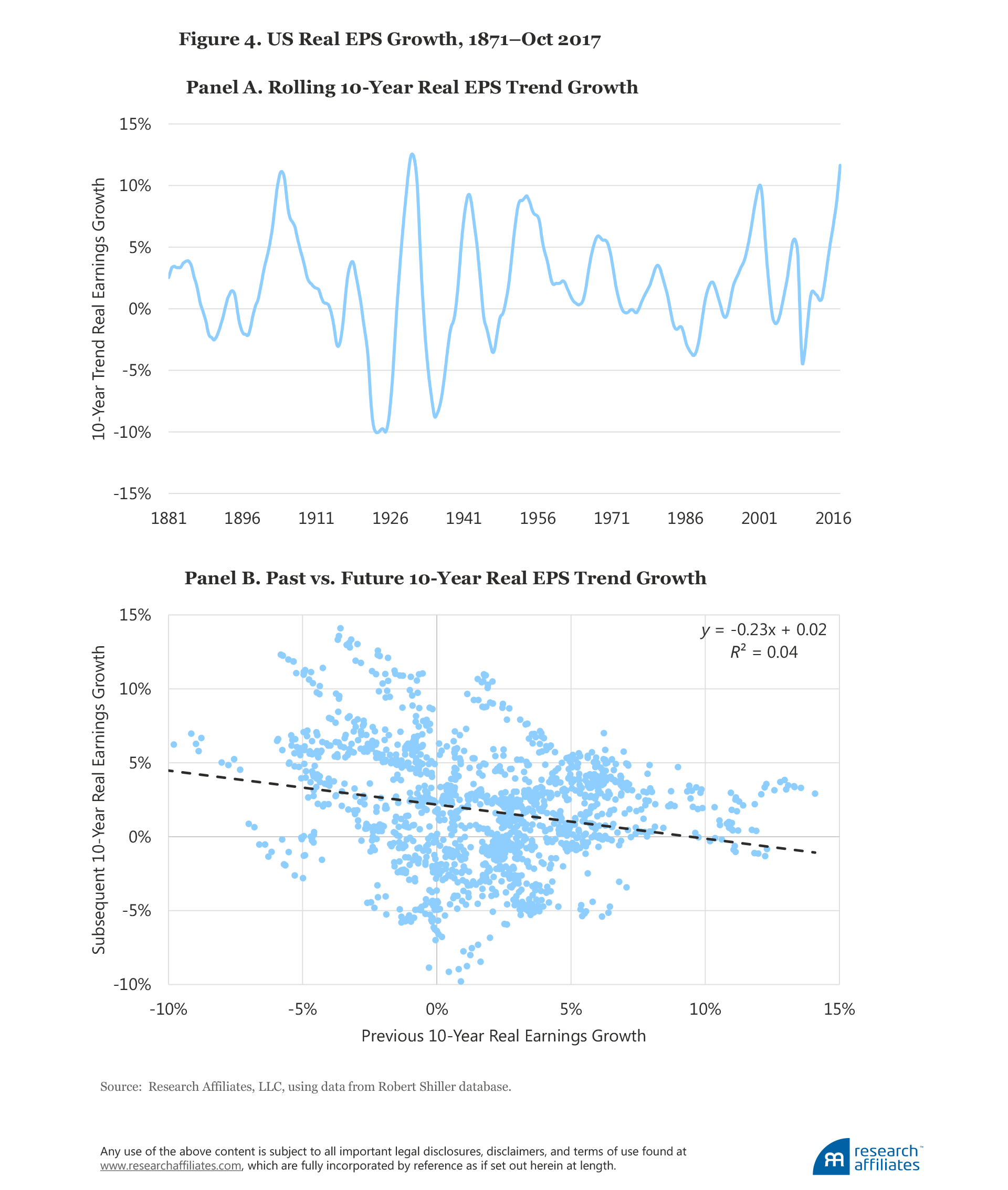
Figure 4, Panel A, clearly shows the cyclicality in trend 10-year EPS growth. And Panel B shows that, for 10-year horizons, past EPS growth does not indicate future EPS growth. Indeed, we observe a moderate negative linkage between past and future EPS growth. Shiller’s research showed that CAPE ratios do not predict future growth rates; he found that some of the strongest mean reversion in the capital markets is between past and future earnings growth rates. We do not think this time will be different.
Inaccuracies in Earnings Measurement
Wharton Professor Jeremy Siegel is one of the most outspoken critics challenging the relevance of the current high CAPE ratio in the US market. Siegel (2016), although not against using CAPE as a valuation tool, finds many problems with its denominator, the real earnings measure, which lead him to question whether the market is anywhere near as expensive as the CAPE ratio would suggest. He argues these problems with the denominator artificially boost current CAPE levels relative to historical norms. Siegel’s objections to the standard CAPE formulation fall into three categories:
1. CAPE is not robust to secular changes in real per share earnings growth.
2. Current earnings are lower as a direct consequence of changes in accounting rules.
3. Other measures of earnings may be more appropriate measures of the US economy.
Let’s take a look at these arguments one by one.
The 10-year average real EPS, the denominator of the CAPE ratio, changes over time. Siegel argues that in periods of high growth, the 10-year average real EPS is biased downward because recent higher earnings are underrepresented; the result is that CAPE is artificially pushed higher.8 Siegel (2016) shows that real EPS growth from 1871 to 1945 was a scant 0.68% a year, then skyrocketed in the post-war period to 3.07%, but the real return on stocks remained essentially unchanged. Both pre- and post-war rates are compound annual growth rates, depending entirely on their starting and ending levels. Why did Siegel choose 1945, a year of deeply depressed earnings as the end point for his “slow-growth” early years and starting point for his “fast-growth” post-war years?9 Trend growth rates, which are far less sensitive to start and end dates, differed much less dramatically at 0.8% pre-war and 1.8% post-war.
Siegel also argues that changes to accounting rules over the last two decades, specifically from FAS Nos. 115, 142, and 144, require companies to write down assets for a variety of reasons, such as impairment of goodwill or to fair market value for securities “available for sale.” The result is that the CAPE denominator is biased downward relative to history when calculated using generally accepted accounting principles, or GAAP, earnings. Companies, however, can bypass these write downs by reporting non-GAAP operating earnings and have increasingly taken the liberty of doing so. Figure 5 clearly illustrates that the operating earnings versus GAAP “gap” that was reliable, but modest, in the 1980s and 1990s has in subsequent years become much larger.
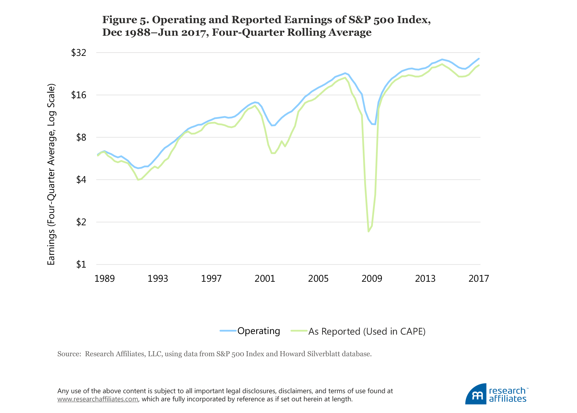
Even if we embrace the use of operating earnings in computing CAPE, it makes comparatively little difference to the outcome when we make the same adjustment to the historical CAPE averages. Although operating and reported earnings can vary dramatically from quarter to quarter, operating earnings have been, on average, 10% higher than reported earnings. The historical norm against which the adjusted CAPE should be compared would also be lower. Tower (2013) has done important work showing that when we embrace Siegel’s many proposed “fixes” for the CAPE, and recompute the historical average CAPE to reflect the changed method, the relative CAPE “signal” changes surprisingly little.10
Finally, as an alternative earnings measure, Siegel argues for the use of the Bureau of Economic Analysis national income and product accounts (NIPA) measure of profits as a long-term data series that can be used without interruption, because it is unaffected by the aforementioned changes in accounting rules. We disagree. NIPA profits includes all US companies, and makes no adjustments for the cost of starting new businesses or taking companies private. The natural dilution associated with entrepreneurial capitalism (IPOs and secondary equity offerings) reduces shareholders’ ownership interest in existing public companies—it’s as if we can get these new stock offerings for free. Also, because NIPA profits includes all companies, public and private, it gets an added boost from the fact that the publicly traded share of the economy is shrinking—it’s as if we can pocket the proceeds of privatization and still own the profits of a fast-growing roster of businesses that are being taken private. Finally, NIPA profits is not a globally available measure, limiting our ability to use it to compare international markets, an important feature for investors using financial ratios to determine their desired allocations to these markets.
Changes in the Discount Rate
Recently, our colleagues Aked, Mazzoleni, and Shakernia (2017) looked at discount rates from a top-down macro perspective and found the fair-value multiple for equities is time varying and negatively related to changes in macroeconomic risk. The proxies for these risks are rolling three-year volatility in real GDP growth and in inflation. Their thesis is that a secular decline in macroeconomic risk over the past few decades has made investors more comfortable with holding risk assets at lower discount rates (higher PE multiples). They find, assuming the current low level of macro volatility, that an equilibrium CAPE of 23, which is nearly 30% below the current level of 32, can be justified. As Figure 6 shows, over the past two decades, macro volatility has been low and is currently well under 1%. For equilibrium CAPE to remain at 23, macro volatility must remain at its current low level.
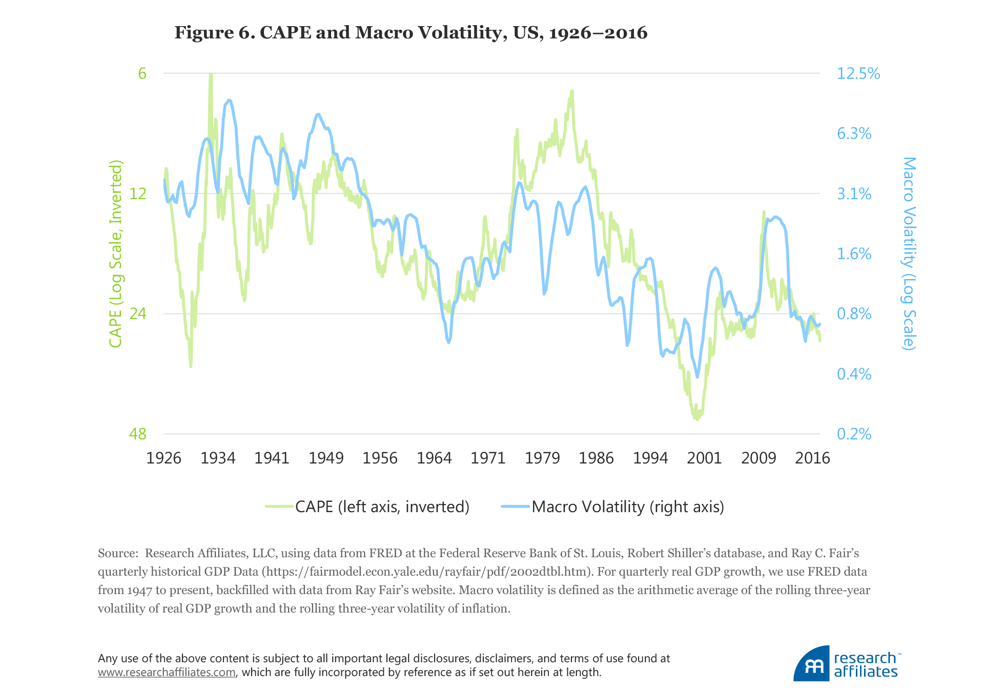
Macro volatility is, unsurprisingly, related to equity market volatility, and recent low macro volatility has helped US equity market volatility hit a near-record low. The drop was significant enough for some to suggest we now live in an era characterized by low volatility. Ironically, similar talking points of sustained new eras of low volatility were common in 1999 and 2007. We all remember what followed. And now US Federal Reserve Chair Janet Yellen is claiming she does not believe we will experience another financial crisis in our lifetimes (Reuters, 2017). We may not see a repeat of 2000–2002 or 2008–2009, but when volatility—whether macroeconomic or equity—hits a historical low, it is more likely to move higher than to continue its march toward zero.
Low Yields and Valuations
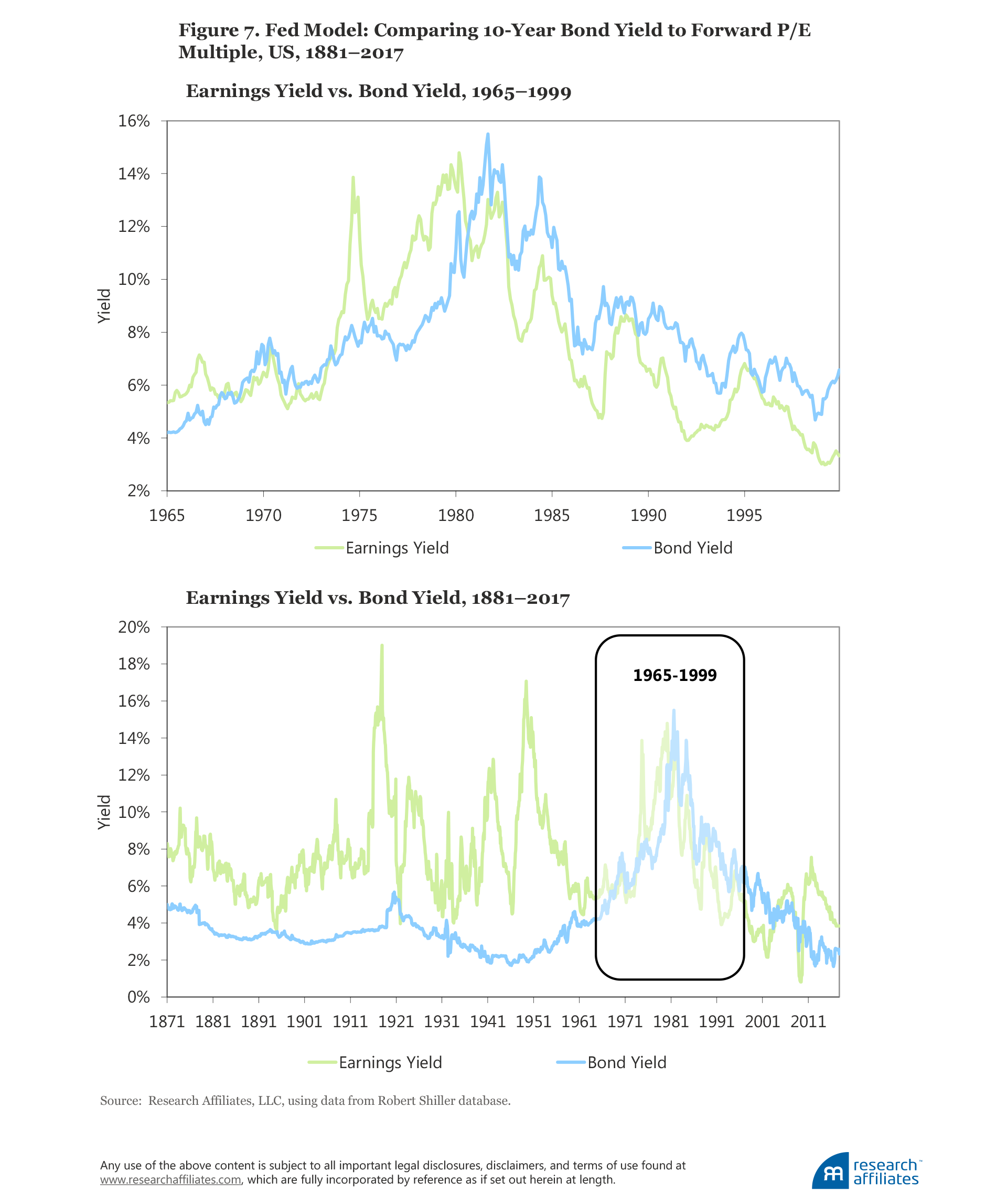
The so-called Fed model presents another argument for changes in discount rates that impact CAPE. The Fed model (a misnomer because the Fed neither owns it nor relies on it) compares the one-year forward equity earnings yield to the interest rate on nominal bonds. Investors have a choice between stocks and bonds, and the Fed model assumes that if the yield on bonds is higher than the yield on stocks, investors will sell stocks and buy bonds until the yields converge, and vice versa. The Fed model is often used to justify higher equity multiples (lower earnings yields). Accordingly, if the 10-year Treasury is yielding 2.3%, then a CAPE multiple of 32, which corresponds to a cyclically adjusted earnings yield (CAEY) of 3.1%, is cheap.
Consider the several problems with this logic. First is the fundamental conflict of comparing nominal bond yields with real equity earnings yields. Second, investors are not limited to just these two asset classes. Finally, we must consider the situation in the 1950s: If 2% yields would justify lofty CAPE ratios today, why did 2% yields not propel the CAPE to lofty levels in the 1950s? In that decade the CAPE ratio ranged from roughly 10 to 20, for an earnings yield of 5% to 10%, a huge mismatch with 2% Treasury yields. And, today, if 2% yields justify CAPE ratios of 32 in the United States, why do 0% yields coexist with 16x CAPE ratios in Europe?
Let’s nail the coffin shut on the Fed model with some historical evidence.
During the 1990s, the Fed model gained popularity because of the CAEY’s wonderful fit with the 10-year Treasury bond yield over the period 1965–1999, as illustrated in Figure 7, Panel A. Panel B spans the much longer period of 1881–2017. No one would suggest a linkage based on the terrible fit before 1965, nor would anyone suggest a linkage after 1999. What was special about 1965 to 1999? During these years inflation was soaring, then tumbling, driving nominal interest rates first higher, then lower. By driving economic uncertainty up, then down, inflation had a like impact on stock market earnings yields. The result was a unique span of time in which stocks and bonds exhibited an aberrant positive correlation. As has been well documented in the academic literature, the correlation between stocks and bonds becomes starkly positive when inflation is above roughly 3%, but a strong relationship is not observed between inflation and stock–bond correlation when inflation is below 3% (e.g., Ilmanen, 2003).
We can summarize our view of the CAPE skeptics’ arguments as follows: First, the arguments in support of future high EPS growth are rather weak. EPS growth is notoriously hard to predict and extrapolating recent history to estimate the future is a terrible way to forecast future growth. Second, the arguments related to inaccuracies in earnings measurement reveal that alternative measures are no less prone to problems. Third, the arguments for a higher CAPE ratio due to changes in the discount rate also raise many questions. Current very low macroeconomic volatility does imply an elevated equilibrium CAPE ratio, but only of about 23; the current CAPE ratio is 40% higher. More important, the low discount rate driving a higher equilibrium CAPE ratio implies a lower future return from depressed returns over the long run, and an even worse outcome if valuations mean revert toward historical norms.
What Can Cause CAPE to Tumble?
Most of the explanations we have discussed for the rise in the CAPE ratio are inherently temporary and are subject to the risk of mean reversion The CAPE naysayers tend to focus on the reasons why a high CAPE ratio can support a high return and tend to ignore the reasons this may not be the case. Let’s look at what could cause the equilibrium CAPE to fall back toward, or even below, its long-term average, causing the current level of CAPE to tumble. We identify two major structural changes that could push CAPE lower: the demographics of an aging work force and further changes in EPS growth.
An Aging Work Force
The population of the developed world is aging, which is putting pressure on economic growth as well as producing headwinds for valuations. For much of the second half of the 20th century, developed economies enjoyed a rising support ratio, or a growing working-age population relative to nonworkers (children and retirees). Arnott and Chaves (2013) pointed out the confluence of demographic conditions that created several decades of economic benefits: the population of children tumbled; the work force was dominated by young adults, rapidly ramping up their productivity as they honed their skills; and the number of senior citizens was small, drawing only modestly on the GDP produced primarily by the young work force.
Although fewer children benefitted earlier generations, today it means we have fewer younger workers in the economy relative to older workers. Peak earning power, and hence peak productivity, typically occurs for workers in their 40s or 50s. For workers beyond this age, the growth rate of productivity is at its smallest, eventually turning negative in the final years of work, and starkly negative when the person enters retirement.
In 2010, the United States had roughly 4.5 working-age people (ages 20–65) for each person of retirement age. By 2030 this ratio is expected to fall to 2.7.11 Arnott and Chaves (2012) showed that GDP growth is propelled by young adults in their 20s and 30s, and is hurt badly by a population with a disproportionate share of senior citizens. In 1950, the average age of the US population was roughly 30, and one in eight adults was a senior citizen. Today, the average American is 38 years old, 20% of the population are seniors, and both figures are rising quickly. The reduced productivity associated with an aging population, combined with a falling support ratio, should be a powerful force slowing economic growth and associated EPS growth.
Post-WWII demographics have also had an impact on investments. As the baby boomers aged, many realized they weren’t saving enough for retirement and became valuation-indifferent buyers (either directly or through their pension programs), even willing to accept negative real returns, as they urgently accumulated financial assets in order to have money to buy goods and services in retirement. Are these buying pressures from soon–to-be retirees contributing to the recently high CAPE ratios? Our research would support this thesis.
In retirement, the baby boomers will likely choose to de-risk, first selling their equities in exchange for safer assets, then becoming valuation-indifferent sellers, willing to sell regardless of price or yield because they need to convert financial assets into consumption goods. This de-risking should push stock market yields higher and CAPE ratios lower, and eventually push real bond yields higher too.
Chaves and Arnott (2012, 2013) used regressions across 30 countries, spanning 60 years, to gauge the linkage of demographic profiles with stock market returns. We have reversed this analysis in order to find the dividend yield that corresponds to those demographic profiles. When we are interpolating within demographic profiles that have been seen before, we can measure the uncertainty of our forecasts. When we are extrapolating past relationships to apply them to demographic profiles that have never been seen before, we cannot. So, extrapolation into uncharted territory is a far more dangerous use of this kind of model. Figure 8 illustrates that the high yields of the 1970s and the low yields of the 2000s were arguably a normal result of demographic pressures.
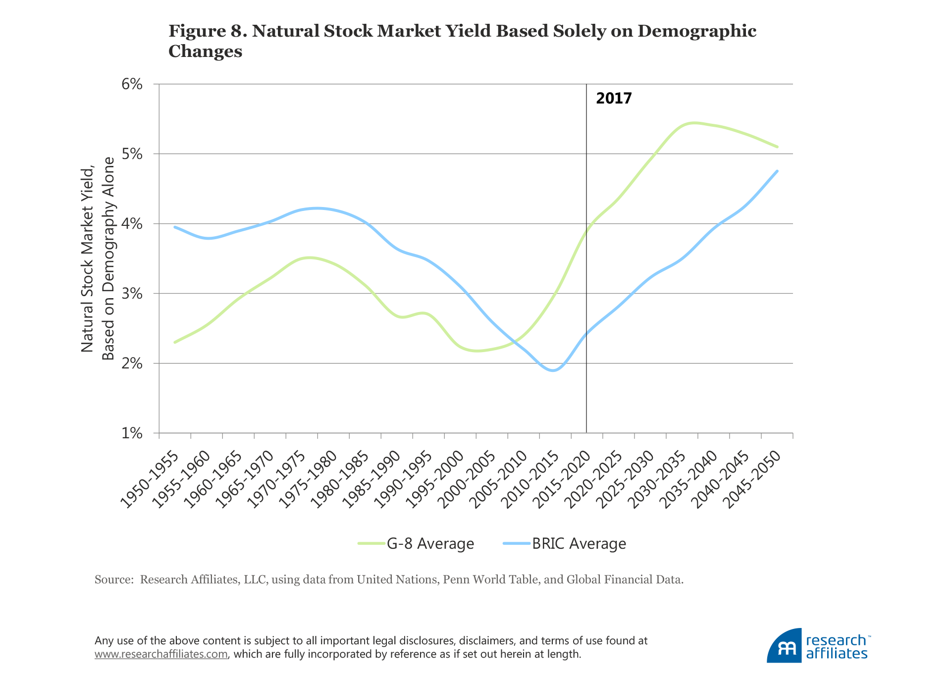
Figure 8 suggests that by 2030, yields in the developed economies may exceed 5%, and would likely already be on their way there now, absent the unprecedented central bank interventions we have witnessed, but which cannot be expected to continue indefinitely. Because this forecast is based on extrapolations of past relationships, it would be reckless to suggest it is in any way precise, but we believe the resulting forecast is at least directionally correct.
One offsetting condition might be that higher yields and the resulting lower market levels could easily prompt millions to defer their retirement dates, and thus mitigate the upward pressure on yields. In any event, we can confidently suggest that demographic pressures are likely to be a headwind for asset valuation levels over the next 15 to 20 years as valuation-indifferent buyers become valuation-indifferent sellers, needing to sell at whatever price is available in order to buy goods and services in retirement.
Other Influences on EPS Growth
Stock market earnings per share grow in the very long term at a rate roughly equal to the GDP per capita growth rate, not the GDP growth rate. Why not the latter? Economic growth consists of the growth of existing enterprises and the creation of new enterprises. A healthy economy will experience robust entrepreneurial capitalism, with substantial and sustained new enterprise creation. The growth of existing enterprises is therefore slower than macroeconomic growth. An investor in the broad market is diluted by both share issuance of new companies and by secondary equity offerings as existing companies look to fund new initiatives.12Therefore, on average, per share earnings growth of existing companies must be slower than GDP growth.
In Figure 9, Panel A, we display the 10-year average GDP per capita growth rate. In the last decade the GDP per capita growth rate was almost one percentage point lower than the post-war average. Two factors are primarily responsible for the recent slowdown in growth of GDP per capita in the United States, as well as in Europe, Japan, and the rest of the developed world:
- Slow business formation. The increasing monopolization of business and industry (cited by Grantham [2017] as impacting the future EPS growth rate) as well as the cooperation between government and established big business known as “crony capitalism” are likely limiting new business creation. The latter force can stifle entrepreneurial capitalism with a web of complex regulations and tax laws, easy for big companies to navigate, but far more difficult for start-ups to manage.
- Slowing innovation. Past innovations led the way to remarkable increases in productivity, mobility, and speed of communication. Compare the productivity-boosting impact of the internal combustion engine, electricity, railways, penicillin, indoor plumbing, telephone, radio, and the computer to the impact of newer innovations such as Twitter, Facebook, and the iPhone; the comparison pretty clearly favors the former.13
Maybe earnings as a share of GDP can grow further; after all, as we can see in Figure 9, Panel B, earnings have grown handily in the last decade, from roughly 6%—the long-run average before 2008—to more than 9% in recent years. Grantham views this transition as evidence of strong earnings, justifying a higher CAPE ratio.
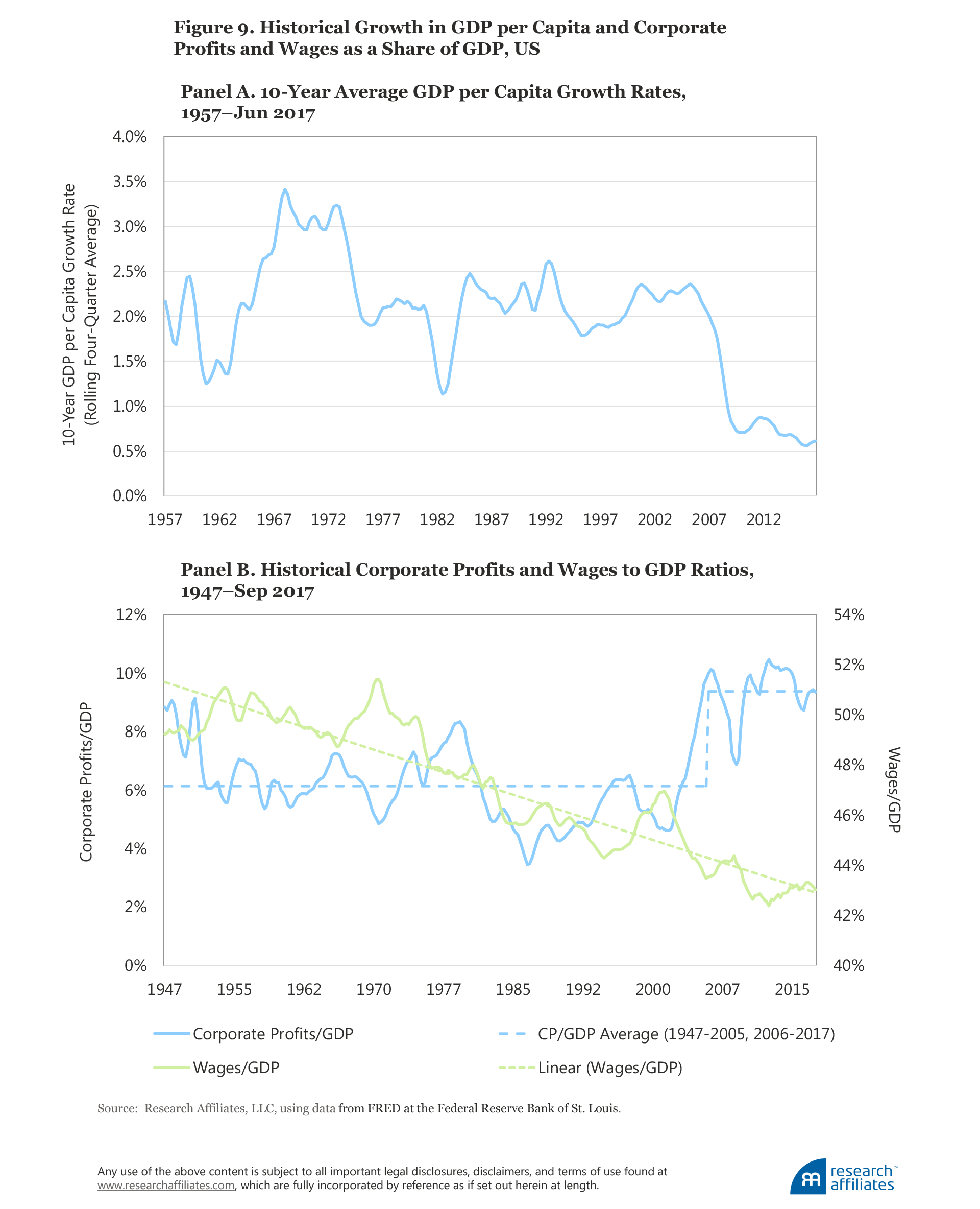
But will this ratio of profits to GDP keep growing in the future—a condition necessary to justify higher CAPE ratios—or will it mean revert? For profits to become a larger share of GDP, some other component of GDP would need to shrink. In the last 50 years, the shrinking element was wages and salaries. The ratio of wages to GDP has been steadily declining from about 50% in the 1960s to about 42% today. As a result, the median worker has experienced no growth in real wages since about 1980.14
The US market has experienced long periods without a new high in real earnings per share. In 1916, on the eve of US involvement in World War I, real per share earnings for a capitalization-weighted market portfolio peaked and did not achieve a new high, adjusted for inflation, until the end of 1950, 34 years later. Obviously, no one should harbor the illusion that earnings will hit new highs with every market or economic cycle. What was the warning sign in 1916? Profits were very near record levels as a share of GDP.
In our view, the recent trend of rising US corporate profits has likely run its course. Can real wages, unchanged for decades, continue to stagnate without a backlash from workers? Populist pressures that can inhibit global trade and immigration, and can promote redistribution, seem unlikely to go away. All of these forces represent headwinds capable of stalling (or reversing) recent growth in profits as a share of GDP.
What’s Right with CAPE?
By dwelling on the potential flaws of a metric such as CAPE, it’s easy to become disillusioned and want to disregard it completely. Before we do that, let’s review what CAPE brings to the table. CAPE shows remarkable efficacy in forecasting long-term equity returns, not just in the United States but across the world,15 providing investors a consistent tool for comparing potential equity market investments. The fit is imperfect, but impressive.
Figure 3 showed that CAPE within each country is a powerful predictor of that market’s return, albeit with each country having a different equilibrium level of CAPE. Should we not question paying $32 for every $1 of earnings in the United States when Canada is trading at 20x earnings, Germany at 19x, and the United Kingdom at 14x, especially when these three markets are all trading near their respective historical CAPE norm and the United States is not?
We acknowledge that a country’s multiple reflects the unique risks of that country. For example, Canada relies heavily on its resource industries, the United Kingdom is grappling with Brexit, and Germany faces uncertainties about the future of the EU and the euro. Accurately assessing how these risks will affect each nation’s future growth prospects and respective discount rates is difficult. Nevertheless, we have confidence in stating that if the differences in CAPE levels arise solely from differences in discount rates associated with different levels of risk, then we should expect higher rates of return for the more cheaply priced countries, suggesting, at the very least, caution is warranted in our consideration of allocating to high-multiple countries. Our observation is not intended as a recommendation of any specific country, but simply to make the point that CAPE allows this type of comparison.
The rationales offered by many to justify the high CAPE ratios in the US market are no less applicable in international markets, and therefore allow for the same type of analysis. An aging population with an urgent need to save? No less true for Europe or Japan. Low interest rates that allow higher multiples due to a reduced discount rate? Europe and Japan have even lower rates. Record lows in macroeconomic volatility permitting higher multiples and lower yields? No less true for most of the rest of the world. Why, then, should US CAPE be significantly higher than the CAPE of other developed markets?
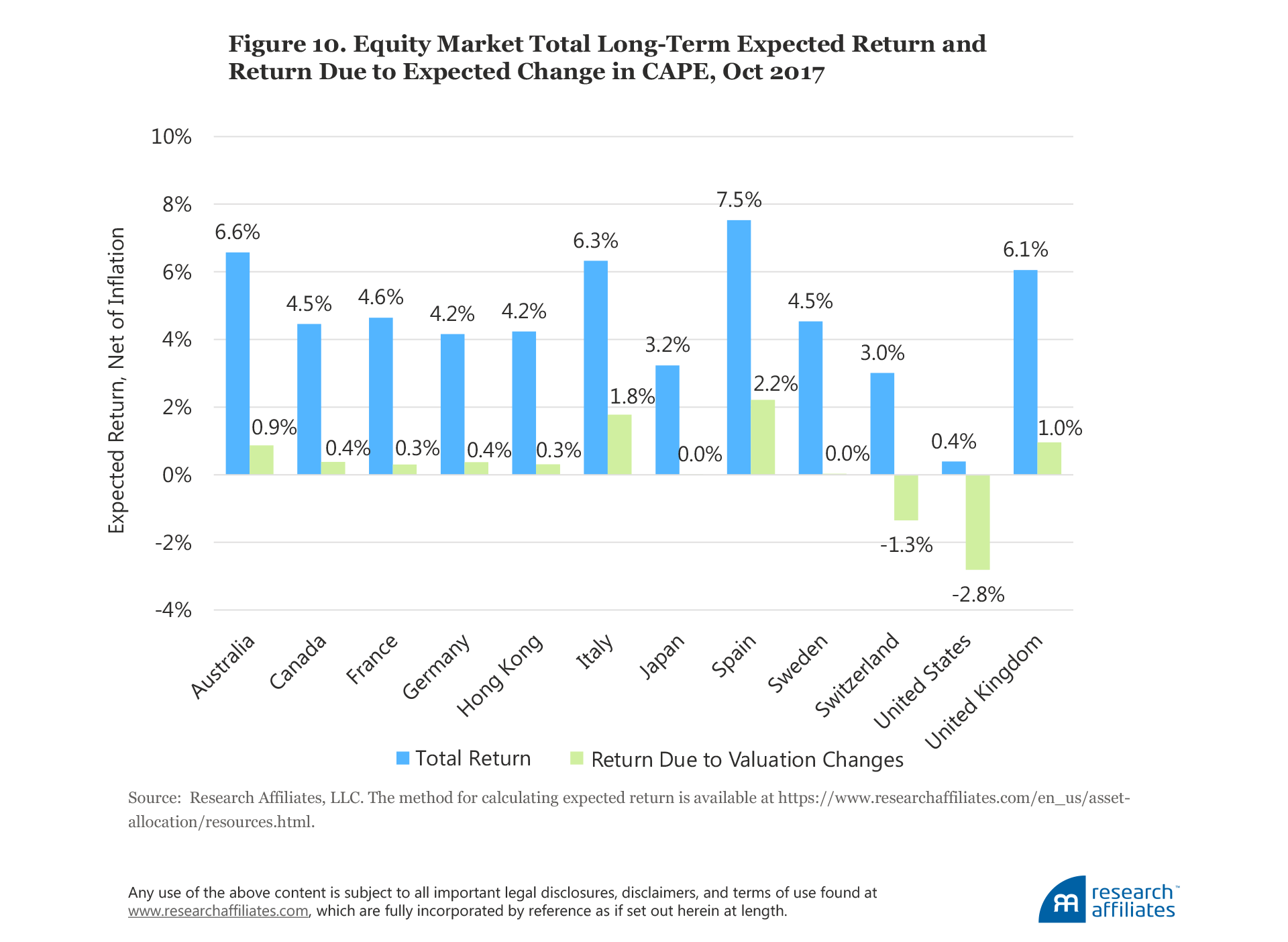
We use CAPE in our Asset Allocation Interactive (AAI) website tool. Figure 10, derived from data on AAI, compares our projected returns for the 12 markets included in Figure 3. The green bars in Figure 10 assume CAPE ratios and currencies move just halfway back to historical valuation norms over the next decade. In the US market, the most recent CAPE points to a 10-year real return expectation of 0.4%,16reflecting a revaluation headwind of 2.8% a year for current valuation levels. The other developed markets have expected real returns ranging from 3.0% to 7.5%, in US dollars. These higher forecasted returns are due partly to higher current dividend yields, but also to less risk of a tumbling CAPE ratio in the years ahead, paired with expectations of currency appreciation in countries with recently depressed currencies.
An individual market’s returns are volatile and can stray far from the forecasts implied by valuation models. Masturzo (2017) documents that the 10-year return often deviates as much as 4% from the forecast implied by the CAPE ratio alone. In the spirit of that analysis, let’s take a look at other valuation metrics.
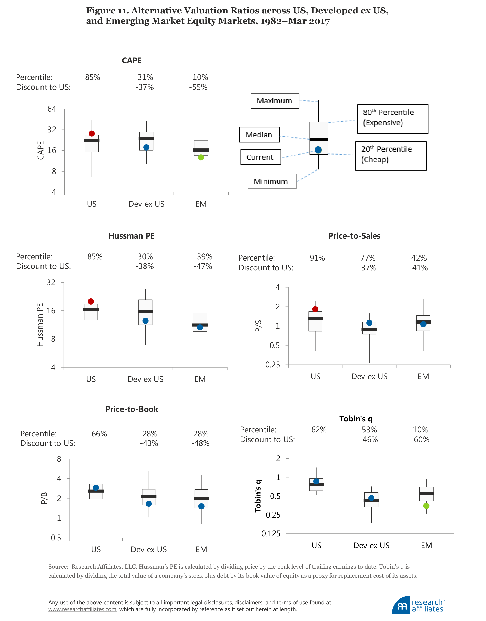
As much as we may beat the drum for CAPE, it’s hardly the only game in town. We look at the Hussman PE, price-to-sales ratio, price-to-book ratio, and Tobin’s q (Figure 11). A comparison of CAPE with these four valuation metrics, each against its own time series, shows the US market has been on the high side of the historical trend of all five metrics for some time.17 We find that developed ex US equity markets are cheap based on three of the five metrics relative to their respective historical norms, and that emerging equity markets are cheap based on all five measures. Relative to the US market, developed ex US equities are priced 37% to 46% cheaper, and emerging market equities are priced 41% to 60% cheaper.18
Conclusion
Every time the CAPE ratio suggests caution, CAPE skeptics suggest we should ignore it. We are highly confident those offering eulogies today for the CAPE ratio are premature—as has been the case repeatedly in the past. We readily acknowledge that the historical average CAPE of 16.6 is a poor guess for today’s equilibrium valuation level, as both Jeremy Siegel and we at Research Affiliates have written about in the past. But even after dickering over accounting rules and growth rates, the fact remains the US equity market looks expensive. If we take out the extremes of 2009, perhaps the current multiple is closer to 29 than 32. If we adjust for accounting rules, perhaps the equilibrium is 20. When the US CAPE hits 20, then we can have a spirited debate about whether we’ve reached fair value or are still a little richly priced.
What is often lost in the conversation of the “right” level of CAPE is an appreciation for expectations of return in the absence of any mean reversion. Real EPS trend growth since 1871 has been 1.5%. From all-time peak earnings, as a share of GDP, dare we expect more growth than this? With a dividend yield of 2.0%, this gives us a real return (yield plus growth) of 3.5%, if valuation levels 10 years hence are exactly where they are today. From current valuation levels, dare we expect PE expansion? If not, the maximum likely return over the next decade is 3.5%. Mean reversion to a value of 23 would deliver a scant return of 30 bps a year, whereas reversion to the historical average CAPE ratio of 16.6 would result in a loss of −2.8% a year; both scenarios are net of inflation, but include the positive impact of dividends. Returning to the median valuation level since 1990 would take us to a near-zero real return.
To earn an annualized 5% real return over the next 10 years with a 2% dividend yield, we’ll need 3% real share-price growth. If half the 3% growth comes from earnings growth (matching the trend growth rate since 1871) and half from PE expansion, the CAPE ratio a decade from now will need to be 37. When considering how to invest, we should ask ourselves: Are we comfortable with these heroic assumptions? Or do we want to invest in markets where sensible returns can be expected, based on sensible assumptions about future growth and mean reversion?


Appendix: Why Does CAPE Forecast Returns?
Prior to the early 1980s, academics as well as practitioners used past equity returns as a gauge of expected equity market returns.19 In the academic world, however, everything changed with Shiller (1981). He showed that market valuation volatility was not matched by a similar volatility in aggregate cash flow. This seemingly boring observation had the same effect, in (nerdy) academic finance circles, as detonating a bomb.
What is the significance of this observation? Let us remember that a company’s stock price reflects the valuation of an expected future stream of cash flows. Gordon and Shapiro (1956) developed a very simple model to value cash flows, later named the Gordon Growth Model, in which they assumed the rate of return and the growth rate of cash flows are constant. Under these heroically simplifying assumptions, the price-to-cash-flow ratio for a stock is equal to
which means that a company’s stock-price-to-cash-flow ratio is a function of only two variables: future growth rate of cash flows and future rate of return. More specifically, a high price-to-cash-flow ratio means either that 1) the future growth rate of a company’s cash flows is high or 2) the stock is going to experience low future returns. Shiller observed that price-to-cash-flow valuation ratios were very volatile, while the growth rates barely changed; this meant that valuation levels must predict future equity returns.
A few years later, Shiller and Campbell (1988) showed that variations in dividend yields do not forecast the growth rates of future cash flows, but do forecast future market returns. Recognizing that dividends are a poor measure of a company’s cash flows, Shiller and Campbell used a ratio of real (net of inflation) market price relative to 10-year average of real earnings—which they called the cyclically adjusted PE, or CAPE, ratio—to reach the same conclusion. Almost three decades later, Shiller received the 2013 Nobel Prize in Economics, largely in recognition of his research on the long-horizon importance of valuation.
The Gordon Growth Model, which assumes constant returns and constant growth rates, is an oversimplification, but because valuations cannot grow indefinitely, Shiller’s logic applies: valuations should predict either future cash-flow growth or future returns, or a mix of the two. If valuations do not forecast future growth rates, they must forecast future returns, and indeed they do; the log of CAPE offers a correlation with subsequent 10-year and 20-year stock market returns that is even stronger than −80% in the 90 years covered by the Ibbotson data, and a still-impressive −58% in the 135 years spanned by the Shiller data.20
CAPE is many value investors’ North Star, guiding them as a beacon, revealing the market as either cheap or rich. Some investors follow this signal with religious fervor as a one-stop shop in all markets, at all times. The zealots should recognize that, like the blind men disagreeing about the nature of an elephant (one measuring the leg, another the trunk, another the tusk, another the ears), CAPE gives us an incomplete picture. CAPE, like all financial measures, is only one imperfect measure. A cult-like adherence to a single valuation metric can lead to missed opportunities at best, and at worst, can be value destroying. As we have clearly demonstrated, however, ignoring CAPE is not a sensible choice. We recognize CAPE is an imperfect market-timing tool, at best, but supported by a strong empirical and theoretical background.
Endnotes
1. The extant finance and economic literature lacks a commonly acceptable theoretical model to explain the equilibrium level of market valuation ratios, for which the equilibrium level would be the level to which the CAPE ratio should migrate. Therefore, in the context of CAPE, we are not using “equilibrium” in the strict finance definition of the word. Rather, we are observing an empirical normal level, toward which the CAPE ratio appears to mean revert. We also assume throughout the article that this equilibrium level may be time varying and influenced by a number of economic factors.
2. We match the log of the CAPE to the subsequent S&P 500 return. This is not an accident or data mining; the same annualized price change—over and above growth in earnings and dividends—is needed in order to move the CAPE market valuation ratio from 5x to 10x as from 25x to 50x. Therefore, the log of the CAPE is the correct predictor for future long-term annualized market returns.
3. Boudoukh, Richardson, and Whitelaw (2008) were the first to demonstrate the market is actually quite predictable in the short run, with the slope of short-term predictability higher than for the longer term; however, significant uncertainty overwhelms the predictive power. The fact that the slope is steepest at the one-year horizon is often overlooked.
4. Our research has explored demographic drivers for shifting equilibria in dividend yields, hence, indirectly in CAPE. Higher numbers of mature working-age adults (ages 40–60) go hand in hand with higher equity valuation levels and lower yields. Higher numbers of senior citizens correlate with sharply lower valuation levels and higher yields. Our research suggests a crossover, with a doubling of yields, in the coming 15 years.
5. Our colleagues Aked, Mazzoleni, and Shakernia (2017) showed that economic volatility is powerfully linked to the CAPE ratio. When economic volatility is low, the natural CAPE ratio can be much higher. The Achilles’ heel in this relationship is that low economic volatility is unlikely to remain low indefinitely. Economic volatility exhibits strong mean reversion.
6. Recall American economist Irving Fisher’s famous observation on October 17, 1929, that “stock prices have reached what looks like a permanently high plateau.” He uttered these words three months after the market peak, just four days before the Crash of 1929 got under way and the market plummeted almost 30% in a single week. Although we cannot confidently declare a “permanently high plateau,” we can assert with some confidence that if high valuations are sustained, then lower long-term future returns are likely to be the new normal. GMO’s Inker (2014) differentiates between a “purgatory,” in which markets plunge to valuation levels that permit respectable subsequent returns, and a “hell,” in which valuations remain lofty and future returns are permanently impaired.
7. In real terms, however, earnings are still below their 2014 peak; we’ve merely recovered part of the 2014–2016 earnings slump.
8. This argument can play out two ways. The point of using the 10-year average in the CAPE ratio is to smooth out earnings peaks and troughs, so the PE ratio is not distorted by either current peak or current trough earnings and creating an aberrant understated or overstated, respectively, PE ratio. In this sense, Siegel’s argument seems somewhat at odds with the core purpose of the CAPE. A few counters to his argument bear mention. Most 10-year spans encompass two earnings downturns so that one unusually deep downturn does not necessarily distort the CAPE. If, in the next two years, we do not have an earnings downturn, then the CAPE ratio will consist only of strong earnings with no recessionary lows, for the first time ever, leading to an artificially depressed CAPE. Finally, if we simply replace the average of 10-year real earnings, the CAPE dividend, with the median of 10-year real earnings, and thus neutralize the effect of artificially low earnings, the CAPE series does not change much from the standard series.
9. Real per share earnings were 40% higher in 1940 and 120% higher in 1950 compared to 1945.
10. Tower (2011, 2013) has examined many of Siegel’s proposed corrections to the CAPE ratio. He created alternative histories for CAPE, incorporating the proposed corrections in the historical data, so that the adjusted current CAPE could be compared with a similarly adjusted historical CAPE. He found that with this “corrected” apples-to-apples comparison, the predicted long-term future return from the corrected CAPE measures differed from the forecast of the standard CAPE measure by less than two percentage points, in all cases.
11. The situation is even more striking in Japan. A remarkably little-known fact is that Japan’s GDP per working-age adult has been growing faster than that of the United States or Western Europe, even though Japan’s GDP growth seems stalled. How can this be? Sluggish GDP growth, in a context of a shrinking working-age population, is actually rather impressive!
12. Many in the economics profession fail to grasp this basic truism: The growth of all existing businesses cannot match GDP growth because new enterprises will dilute their role in the future private sector. Extant businesses will not compose 100% of the future private sector. How fast does this happen? Of the 20 largest market-cap companies in the United States, five, composing 36% of the market cap of the top 20, did not exist as publicly traded businesses 30 years ago. Two, composing 12% of the market cap of the top 20, did not exist as publicly traded businesses 15 years ago. This would suggest that existing businesses have seen their share of aggregate market value diluted to 64% of their starting share in just 30 years as a consequence of entrepreneurial capitalism—a 1.5% dilution of existing businesses’ share of market-cap per year (See Bernstein and Arnott, 2003).
13. One of our favorite observations is that in 1820 a message could go from one city to the next at the speed of a horse, the same speed that had prevailed for millennia. But in only a decade, between the invention of the commercially viable railway in the 1820s and the telegraph in the 1830s, a message could be transmitted at the speed of light. Talk about disruptive technologies!! Railroads, telegraph and electric companies, radio and automobile companies were the internet fliers of their eras.
14. Of course, a comparison of incomes between 1980 and today can be quite challenging. The CPI has a hedonic adjustment to reflect this type of challenge, but real wages, despite such adjustment, may not fully capture rising life expectancies or improved quality of life. The downside is that many innovations crush the wages of unskilled labor and can show up as a drop in GDP. Perhaps more important is that the lack of growth in median income emphasizes the rising inequality in wealth distribution, which can put strong political pressure on profits as a means to satisfy calls for a more-equal distribution of wealth.
15. CAPE also shows promise in emerging markets, but over much shorter time spans, so we are ignoring this region in our analysis.
16. This is based on our publicly available equity valuation methodology, which compares CAPE to a target value half way between the current value and the long-term average. More detail is available at https://www.researchaffiliates.com/content/dam/ra/documents/asset-allocation/aa-methodology-822.pdf.
17. Brightman, Masturzo, and Beck (2015) offer a long-term comparison of valuation metrics for the US market.
18. A number of structural reasons—for example, different accounting conventions—can explain why a particular valuation ratio indicates different relative valuation levels from one market to another. That said, if multiple models, each with its unique idiosyncratic bias, all point in the same direction, the confidence that the US market is expensive or cheap relative to other markets strengthens the conclusion, and suggests the conclusion is not a result of mismeasurement specific to CAPE.
19. Actuaries, however, are still required to forecast future stock and bond market returns based on extrapolating past returns.
20. For skeptics of the early data, the correlation in the 70 years since World War II is 60%, while the correlations for EAFE and for the emerging markets, over the past 35 and 25 years, respectively, are north of 75%.
References
Aked, Michael, Michele Mazzoleni, and Omid Shakernia. 2017. “Quest for the Holy Grail: The Fair Value of the Equity Market.” Research Affiliates (March).
Arnott, Robert, and Denis Chaves. 2012. “Demographic Changes, Financial Markets, and the Economy.” Financial Analysts Journal, vol. 68. no.1 (January/February):23–46.
———. 2013. “A New ‘New Normal’ in Demography and Economic Growth.” Journal of Indexes (September/October):22–31.
Arnott, Robert, and Ronald Ryan. 2001. “The Death of the Risk Premium.” Journal of Portfolio Management, vol. 27, no. 3 (Spring):61–74.
Batnick, Michael. 2017. The Irrelevant Investor.com. (July 7).
Bernstein, William, and Robert Arnott. 2003. “Earnings Growth: The Two Percent Dilution.” Financial Analysts Journal, vol. 59, no. 5 (September/October):47–55.
Boudoukh, Jacob, Matthew Richardson, and Robert F. Whitelaw. 2008. “The Myth of Long-Horizon Predictability.” Review of Financial Studies, vol. 21, no. 4 (July):1576–1605.
Brightman, Chris, Jim Masturzo, and Noah Beck. 2015. “Are Stocks Overvalued? A Survey of Equity Valuation Models.” Research Affiliates (July).
Gordon, Myron, and Eli Shapiro. 1956. “Capital Equipment Analysis: The Required Rate of Profit.” Management Science, vol. 3, no. 1 (October):102–110.
Grantham, Jeremy. 2017. “This Time Seems Very, Very Different.” Advisor Perspectives, GMO Quarterly Letter (May 2).
Ilmanen, Antti. 2003. “Stock-Bond Correlations.” Journal of Fixed Income, vol. 13, no. 2 (September):55–66.
Inker, Ben. 2014. “Is This Purgatory, Or Is It Hell?” Advisor Perspectives, GMO Quarterly Letter (November 18).
Masturzo, Jim. 2017. “CAPE Fatigue.” Research Affiliates (June).
Reuters. 2017. “Fed’s Yellen Expects No New Financial Crisis in ‘Our Lifetimes.’” Reuters.com (June 27).
Shiller, Robert. 1981. “Do Stock Prices Move Too Much to Be Justified by Subsequent Changes in Dividends?” American Economic Review, vol. 71, no. 3:421–436.
Shiller, Robert, and John Campbell. 1988. “Stock Prices, Earnings, and Expected Dividends.” Journal of Finance, vol. 43, no. 3 (July):661–676.
Siegel, Jeremy. 2016. “The Shiller CAPE Ratio: A New Look.” Financial Analysts Journal, vol. 72, no. 3 (May/June):41–49
Tower, Edward. 2011 “Tobin’s Q Versus CAPE versus CAPER: Predicting Stock Market Returns Using Fundamentals and Momentum.” Economic Research Initiatives at Duke (ERID) Working paper. (December 3).
———. 2013. “CAPE: Using Its Variants to Predict the Returns from Investing in the S&P 500 Index.” Working paper (September 10).
Yardeni, Edward. 2016. “CAPE Fear.” Dr. Ed's Blog. Yardeni Research, Inc. (October 13).
